Interested in this domain and website? Contact [email protected]

eBinder
eBinder


- Get unique ready made logos for $99.99
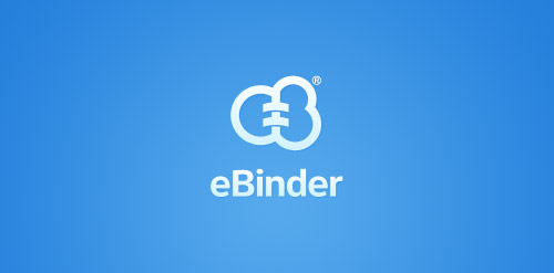
- eBinder is a brand which is into cloud computing and decreasing the amount of paper in accountant companies by electronic archiving. So i thought to have the brand name (E and B) into the logo with their business concept in it..
- Submitted: 10/21/2011 • Featured: 11/21/2011
- Stats: This logo design has 12736 views and is 1 times added to someone's favorites. It has 8 votes with an average of 3.75 out of 5.
Designer
Comments: 5
Leave a Reply
Our logo inspiration gallery will give you the creative boost you're looking for. Get your daily dose of logo design inspiration to work on your own logo design projects and get your business going. Be amazed by our logo designers and their brand guidelines. We are here to help you impress your clients and our fellow designers. Professionalize your logo design skills and get yourself to a new level. Browse our logo design gallery and discover all the new logo design trends and much more. We know you love logos!
clever ;]
Replyhowever i dont like that shades and low trasnaparency gradients on mark and letters
Replytransparency *
ReplyThank you so much Julius.. I was told to keep it by the client :(
ReplyVery nice logo in simplicity lines (except shades and gradients).
Reply