ECCE Femina
ECCE Femina


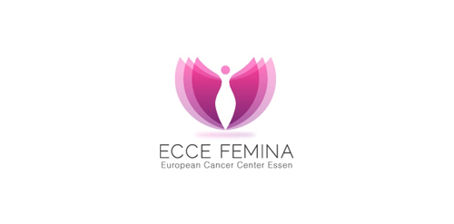
- Concept for a a female hospital with focus on cancer treatment.The client wanted to convey an image of a wellness hotel instead of a hospital through the logo. The mark has a lotus flower with a female silhouette in the middle.The patients coming to the hospital get a second chance at life and what better to communicate this journey than the lotus which has always been traditionally used as a symbol of regeneration and rebirth .The varied layers signify this very process
 Designer: almosh82
 - Submitted: 02/08/2011 • Featured: 02/09/2011
- Stats: This logo design has 11944 views and is 1 times added to someone's favorites. It has 13 votes with an average of 3.77 out of 5.
Designer


