Interested in this domain and website? Contact [email protected]

epro
epro


- Get unique ready made logos for $99.99
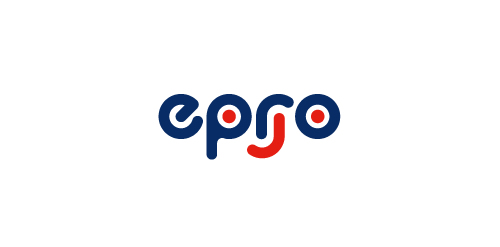
- Epro are a manufacturer of childrens creative toys. The logo was developed in reflection of their tag / motto: "simple, creative joy" with the logo composed of simple shapes (based upon a circle) creatively forming a joyful face with an addition of an upside down "r". The type was built from scratch using a circular shape as a guide.
- Submitted: 02/01/2011 • Featured: 02/14/2011
- Stats: This logo design has 15016 views and is 0 times added to someone's favorites. It has 7 votes with an average of 2.86 out of 5.
Designer
Comments


Our logo inspiration gallery will give you the creative boost you're looking for. Get your daily dose of logo design inspiration to work on your own logo design projects and get your business going. Be amazed by our logo designers and their brand guidelines. We are here to help you impress your clients and our fellow designers. Professionalize your logo design skills and get yourself to a new level. Browse our logo design gallery and discover all the new logo design trends and much more. We know you love logos!
Leave a Reply