
Logo inspiration
Inspirational logos


Logo for a Jazz Club
Logo for music producer


Logo for fun! :)
Blend of heart and salt shaker.

Logo resesign (www.webdesign.org)
Cashmere + Jewelry

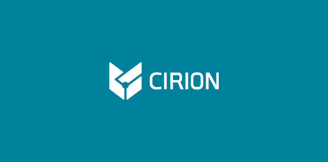
https://www.behance.net/gallery/30876225/CIRION La presente marca tiene como objetivo estratégico representar y comunicar mediante un conjunto de signos visuales, un grupo de ingenieros dedicados al desarrollo de productos y servicios electrónicos. Transmitiendo formalidad, responsabilidad, calidad y continuidad
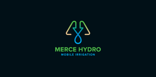
Merce Hydro, a mobile irrigation company based in Northern Victoria, Australia specialise in redevelopment of drought effected areas for the purpose of farming & residential properties. The Mark is based on the use of a water drop, an arrow, pipes & finished off with an M. The arrow symbolises function & the arrow/drop cross section symbolises design - both core factors in engineering & invention of their systems. Green represents growth, their aim. Brown represents destination (drought area) their market. Water represents sustainabilty, their long term plan, and finally the pipe represents management, their ongoing analysis & monitoring of their network.
Custom logo for any courier company.
Logo of Andrychów basketball team in Poland. Official website - http://www.facebook.com/HustlerzyAndrychow

UX Takeaway is a creative platform from UXPin that allows you to explore the best UX/UI shots from around the web. Online soon.
Greatest chicken food
Custom lettering logo for custom made leather belts. :)
Natural body care
Custom letters created for marketing company. "K" letter has incorporated a rook/tower shape which refers to "protect the King" idea. • • • Follow us on www.instagram.com/triptic.pl
Print supplies shop

Orthopedic surgeons
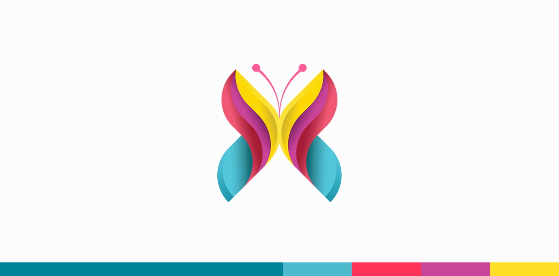
X + Butterfly
☆ HONORS ☆

-
shtef-sokolovich
190 logos
-
Boldflower Design Studio
189 logos
-
Ailton Marques
115 logos
-
Light Rainer
114 logos
-
Alek • Triptic.pl
107 logos
-
almosh82
96 logos
-
sadany
96 logos
-
Duminda Perera
93 logos
-
pizelato™
91 logos
-
Aleksandar
91 logos

Recent comments
حسین:
please send me...
chirag_j:
Hello is the above issue resolved?...
mrgraphics:
great logo...
Aleksandar:
Thank you Gile!...
fraGile:
Thanks a lot!...
Marko Bulatovic:
Great work!...
Popular tags
Our logo inspiration gallery will give you the creative boost you're looking for. Get your daily dose of logo design inspiration to work on your own logo design projects and get your business going. Be amazed by our logo designers and their brand guidelines. We are here to help you impress your clients and our fellow designers. Professionalize your logo design skills and get yourself to a new level. Browse our logo design gallery and discover all the new logo design trends and much more. We know you love logos!