
Logo inspiration
Inspirational logos


Logo
Footy 7s
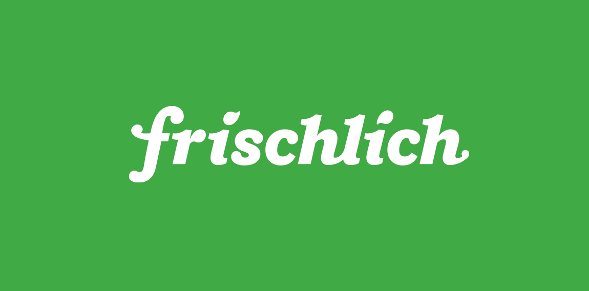
"Frischlich" is a German brand, with the word "Frisch" meaning "fresh" and "lich" in German is an ending for adjectives, "glücklich" = happy or "herrlich" = great. The company delivers fresh produce, meats and cheeses and more to your doorstep, tailored to your family size.
Photographer

music label
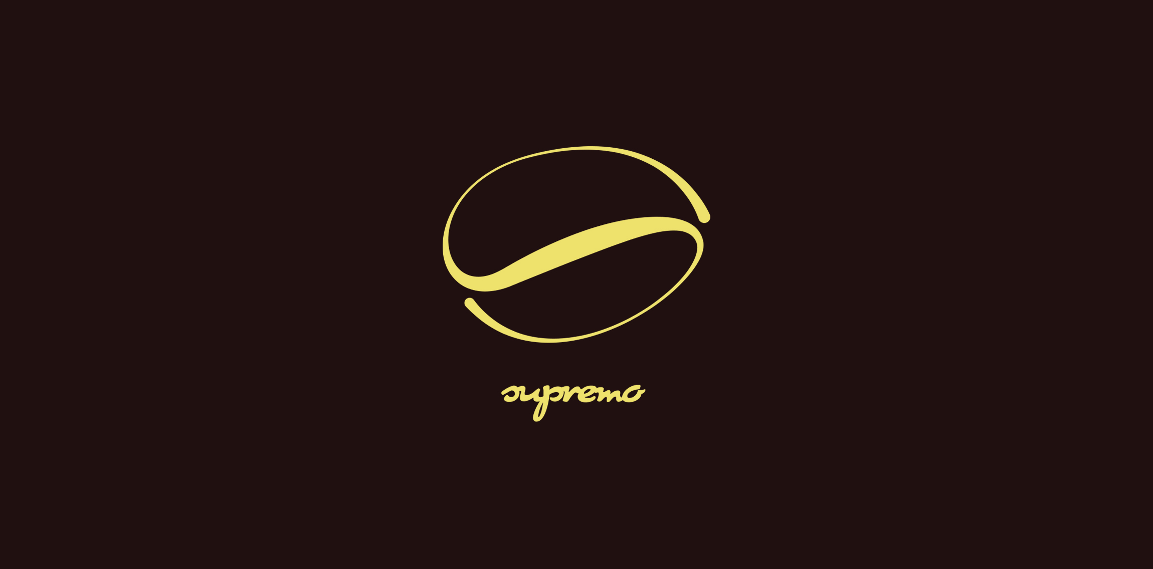
Emblem for a quality coffee dealer and cafe shop.
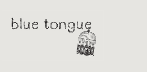
This is an identity for a favourite restaurant and bar to the locals. It is a a local institution and loved by many for being as it was 10 years ago. The client wanted to develop a new brand without upsetting those regulars but appear up to date to new customers.
The mark was inspired by an actual cage that houses their wines at the back of the restaurant. The hand drawn type and illustrations were developed to give the brand a relaxed, children and family friendly environment.
Dieduong logo

For purchasing contact me.
Exclusive Customizable Logo at http://wp.me/s4571j-tombro

Brand and logo redesign for the Harvest Bible Church Logo.
The main challenge was to somehow link in the notion of harvest with the uber symbolic cross whilst keeping this particular church logo free of the visual cliches that often accompany many church logos.
I was approached by the Harvest Bible Church after they had seen the general style of my existing logo portfolio, so this was also a determining factor with the design style. A clean, smart, well defined church logo design was what this client was seeking.
The idea you see is basically formed from the imperfect lines of a soon to be harvest field, but also draws on the idea of a recently ploughed field which sets the beginning and creation of the crop cycle.
The horizontal and vertical lines converge creating this square/hatched shape which provides for a meaningful link to that one place where people will ultimately converge: the church.
Logo for a T-Shirt shop based in Da Nang - Viet Nam
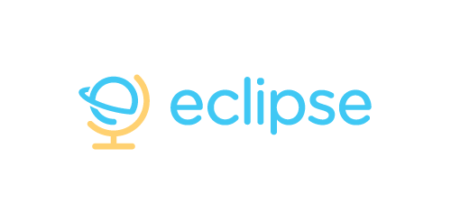
Eclipse offer specialist training software - mostly linguistic, but also teachings on grammar, syntax, etc. The use of the globe device reinforces the idea that language & communication is a ‘global’ exercise. Conceptually the design is of course inspired by a globe on its axis/stand. Since the idea of the eclipse is not necessary representative of solar or lunar, the mark focuses on how eclipses are created, orbit – The precise moment the Earth/Moon orbit is in relation to the Sun. The planet also forming an abstract E, creating a subtle monogram.
This is the logo of an IT company which is based in Romania with focus on the business area and provides complex and complete IT services.
My new personal logo. Full project on Behance: http://www.behance.net/gallery/Self-Logo/1470725
☆ HONORS ☆

-
shtef-sokolovich
190 logos
-
Boldflower Design Studio
189 logos
-
Ailton Marques
115 logos
-
Light Rainer
114 logos
-
Alek • Triptic.pl
107 logos
-
almosh82
96 logos
-
sadany
96 logos
-
Duminda Perera
93 logos
-
pizelato™
91 logos
-
Aleksandar
91 logos

Recent comments
حسین:
please send me...
chirag_j:
Hello is the above issue resolved?...
mrgraphics:
great logo...
Aleksandar:
Thank you Gile!...
fraGile:
Thanks a lot!...
Marko Bulatovic:
Great work!...
Popular tags
Our logo inspiration gallery will give you the creative boost you're looking for. Get your daily dose of logo design inspiration to work on your own logo design projects and get your business going. Be amazed by our logo designers and their brand guidelines. We are here to help you impress your clients and our fellow designers. Professionalize your logo design skills and get yourself to a new level. Browse our logo design gallery and discover all the new logo design trends and much more. We know you love logos!