
Brand-Brothers
 Joined June 2011
 22 logos
 http://www.logomoose.com/members/Brand-Brothers/
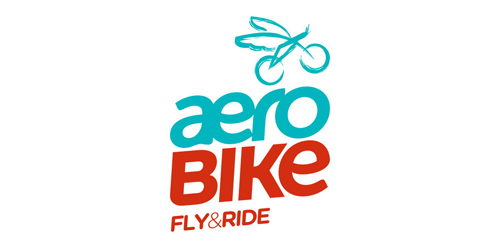
Bicycle rental service for passengers of the Beauvais airport and its employees, or city inhabitants willing to enjoy a fun ride, Aerobike is an innovative service that launched in summer 2010. Brand Brothers created a complite brand identity with a dynamic and fun spirit. With a special typography created for the occasion, an easily identified sign and a strong and colorful graphic, Aerobike is now noticeable in the surrounding landscape!


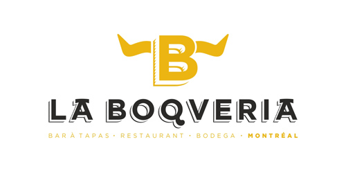
La Boqueria Montréal chose Brand Brothers to take care of its global identity, print and web. An exceptional restaurant and a delicatessen that will open their doors in the heart of Montreal on over 17.000 square feet in 2011.
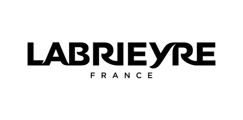
Premium gourmet stove specialist, Labrieyre brings a contemporary knowledge to French tradition. The brand is a newcomer in a highly competed market, but whith a unique positioning on tradition, performance, style and design. Brand Brothers accompanied Labrieyre in brand design, brand identity, graphic, print and web branding, signage and through the identity of the future company stores.
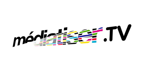
As a new media relations agency specialized in TV and radio, Médiatiser.tv has a very peculiar approach: rigorous, but nevertheless really fun! Brand Brothers played with this approach and created the visual identity of the agency and a graphic universe around a lovable mascot: a crazy, television-headed octopus ... which comes to life online!
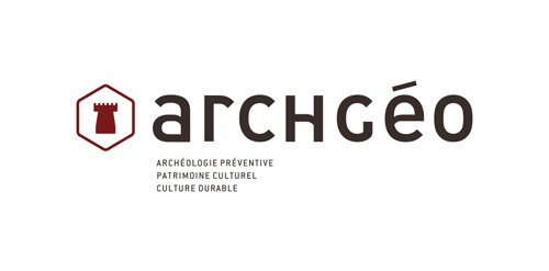
Brand Brothers helps Archgéo, a consulting and engineering office in archeology and cultural heritage in its full rebranding. Using a minimalist but meaningful graphic, the new identity emphasizes the economic aspect (the tower), the French culture (the hexagon), and notions of quality and sophistication with the font created for the occasion.
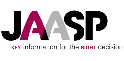
With a high technical expertise, Jaasp gives its customers new management control tools. The name Jaasp is inspired by the jasper gemstone, known for its many natural colors, which was used for the manufacture of prehistoric tools.
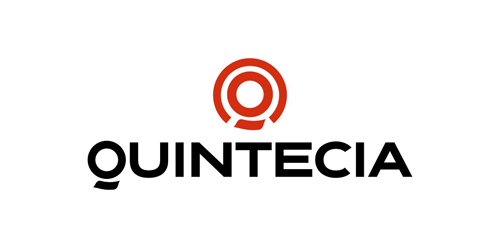
Human resources consulting organization based in Paris, Quintecia trusted Brand Brothers to redesign its corporate identity and its global branding. Professionalism, credibility, transparency and proximity are the values passed through this new identity, wich includes an original typography.
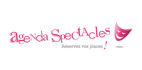
Agenda Spectacle's website is one of the best french online booking sites for theater and arts.
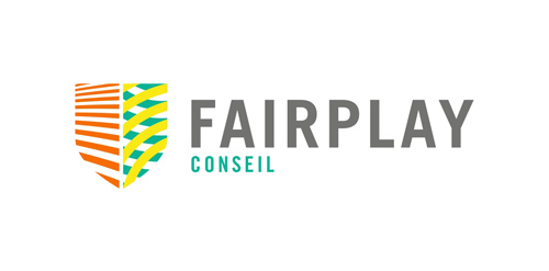
FairPlay is a sports & cultural marketing agency. We chose to design a colorful identity, that could also change and evolve. The logo consists of a shield - evoking the prestige of major sports clubs, with a left side wearing stripes (meaning fair, straight, respectful) and a right side reprensenting the "play" side: curves, meaning creativity, fun, and competition.
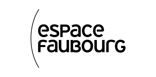
The Espace Faubourg, a few steps from the Elysee, is a place for conferences, meetings and events, and also a think tank and an art gallery.
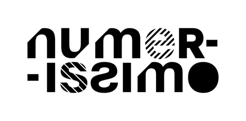
Numerissimo is a company located in Paris specialized in scanning, archiving and editing technologies, with a strong innovative and creative potential. Brand Brothers designed the graphic identity and branding, with a logotype that reminds technicality and graphic works in a simple, pure and creative spirit.
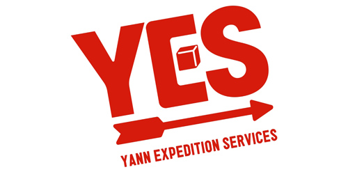
Brand Brothers created the visual identity and branding of this young delivery company with one goal: make it attractive and promote a business whose communication is often neglected by creating a recognizable brand with a strong visual, playing with the main transportation codes.
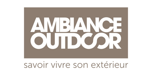
Premium trading that specializes in outdoor furniture and accessories, Ambiance Outdoor is an Elynes brand, as well as 'La Maison de Tante Agathe'. A sophisticated and contemporary global identity, sleek graphic codes, enhancement of all distributed products and brands, the complete branding conceived by Brand Brothers generated a high quality visual environment for Ambiance Outdoor and its customers.
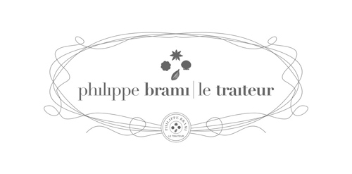
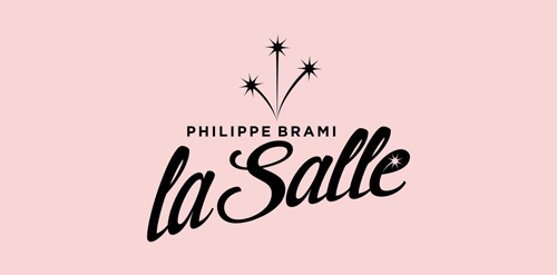
Talented buisnessman, Philippe Brami is also a renowned caterer on Paris for years, organizing receptions for high quality departments or major corporations. Brand Brothers gave the structure a premium brand identity and a chic and retro branding , with a logo inspired by flavors and emblematic ingredients.
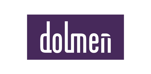
Dolmen delivers telecom, network and ICT solutions, for SMEs and large corporations. A strong name, a growing business, all the ingredients together for Dolmen to be a company that matters. Brothers has developed a global brand identity combining graphic subtleties with a typography created for the occasion. A comprehensive print and web branding is being developed, whose first results have already made visible changes and tangible benefits for the company.
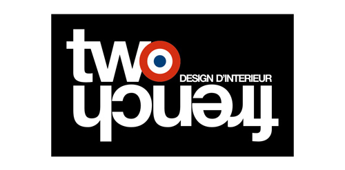
Two french is a Parisian interior designers duo. Brand Brothers created for them their global identity as well as different variations and graphics applications.
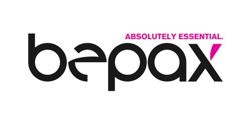
Bepax is a newcomer in airline companies representation and aviation consulting, based in Paris. Brand Brothers designed their visual identity, based on an original typography, and produced a print and web branding that gives Bepax an image in contrast to its competitors.

Sports and lifestyle dedicated portal in London, Totallysportsinlondon comes in a 60-page bimonthly magazine, a website and travel offers to the British capital. Brand Brothers was given the visual identity, print and web art direction of the the brand and started a graphic so british and dandy.
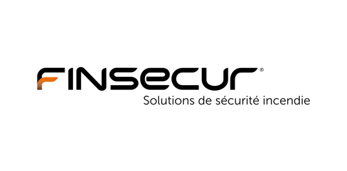
Finsecur is a manufacturer and a French leader in fire detection systems. With competitors like Siemens or Tyco and clients such as M6 or Air France, the company needed to acquire an image to match its ambitions. Brand Brothers has been working since January 2010 to develop the new global visual identity and branding of Finsecur.
For this unique complex of reception halls in western Paris, Brand Brothers wanted to design a festive and retro identity, away from commonplaces, and express the essence of what makes great parties. A complete branding including a website, signage, publishing and advertising is in development: success guaranteed!
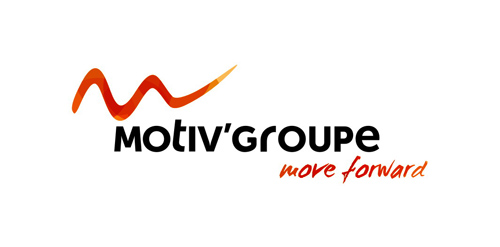
Reseller and consultant, specialist in interactive solutions for education and businesses, Motiv'Solutions is operating in a booming market. With an innovative and complete strategy, the company offers complete solutions: consulting, services, installation, training... Here at Brand Brothers, our challenge was to design for them a professional and reassuring visual identity and branding, that would leave a mark in people's minds.
La Maison de Tante Agathe (Aunt Agatha's House) is a french brand that specializes in culinary products and premium tableware. Located in Paris and Nantes, the brand also has a strong online presence through various websites. Brand Brothers worked with the brand and its company since the beginning. We created for them a premium brand image through a global branding, based on authenticity, good taste and quality.
Our logo inspiration gallery will give you the creative boost you're looking for. Get your daily dose of logo design inspiration to work on your own logo design projects and get your business going. Be amazed by our logo designers and their brand guidelines. We are here to help you impress your clients and our fellow designers. Professionalize your logo design skills and get yourself to a new level. Browse our logo design gallery and discover all the new logo design trends and much more. We know you love logos!