
Circle logos (97)
One of the logo concepts I did for music artist Taio Cruz.


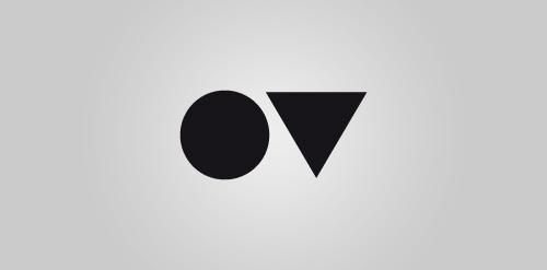
Personal logo for a creative agency, located in Germany. Kreisdreieck stands for the geometrical symbols circle (Kreis) and triangle (Dreieck). The symbols are placeholders for the first letters from my name. O and V. Simple as well ;)
logo for an IT company
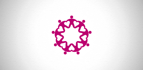
Designer: Denis Aristov Client: National Association of Voluntary Organizations Iindustry: Voluntary, Non-profit Keywords: association, voluntary, people, rounded, ornament, circle, hearts
Logo made for a friend underwater photographer.
For fun.
..
Logo for NUMBER GROUP - financial services.
Personal logo for a photographer
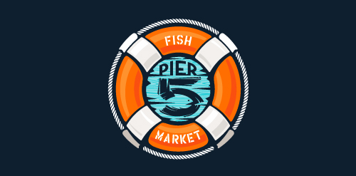
This logo is for a completely fictitious fish market.
The idea came to me when I discovered that it was possible to achieve a fish shape in the negative space within the bowl of the number 5. Dubbing my hypothetical company Pier 5 Fish Market, I created this very maximalist and illustrative mark in the hopes of really capturing the spirit of the nautical and maritime aesthetic. Type is custom for "Pier" and also the number 5, which is hand-rendered to look like it was painted on a wooden sign with a very wide, worn-out, thick-bristled brush. While it was important for the fish to show in negative space, it needed to look like a seemingly happenstance result of logical, real-world brush strokes. In the full lockup, the addition of the life preserver takes less emphasis off this gimmick, allowing one to slowly discover the fish.
Click here to see the case study for this logo, which chronicles its development, and includes full design rationale, sketches, electronic roughs, and alternate designs.
A-Rex Worldwide Music Group produces music from a variety of genres, and helps develop artists through voice lessons, dancing, etc.
Identity for a small design bureau in Ulm (Germany).
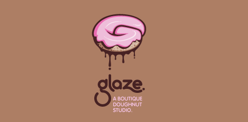
This is a totally fictional company that I refer to as "a boutique doughnut studio." I envision it as a trendy, metropolitan bakery that allows customers to glaze and decorate their own unique doughnuts. I wanted this to look really tactile, gooey, and sweet - like you really want to take a bite. Type for "glaze" is custom, and reflects the roundness of a doughnut. Click here to view my Flickr stream for full design rationale and additional images.
Unused proposal for an electronic dance music label, specializing in Tech House and Electro.
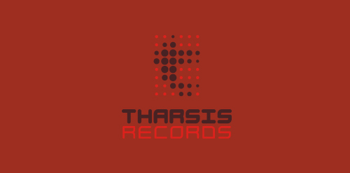
The name is taken from the Tharsis region on Mars, the largest volcano range in our solar system.
The symbol represents the blips and bleeps of the electronic music. Color is indicative of Mars. Custom type coincides with the roundness of the dots, and reflects the synthetic techiness of the music.
Click here to see the case study for this logo, which chronicles its development, and includes full design rationale, sketches, electronic roughs, and alternate designs.
Logo is made for 3d advertisement in Google Earth. The 3d model building for GE, next to which are all the necessary information about the firm. I wanted to avoid stereotypes in 3d form ( three-dimensional ) logo. That is why I decided to put the logo as a target to be the direct hit of the advertisement. The red circle represents the location in Google Maps and the blue middle ( the direct hit of the target) represents the earth.So in our case the Earth has became the main object of the advertisement. And in our case the earth is the main object of the advertisement
Logo Design for a high-end residential contractor based in Colorado.
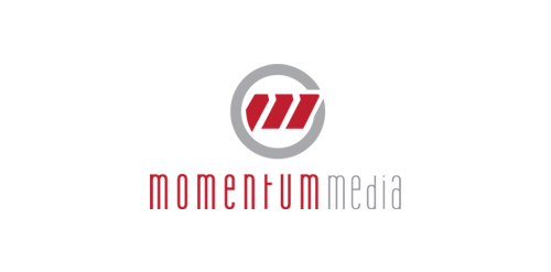
New identity for Momentum Media, a small video production company in Seattle.
Advertising agency
An unused proposal for an executive home staffing company which I turned into an high-end event planner agency. Combining pineapple, a symbol of hospitality, and fleur-de-lys, a symbol of elite.
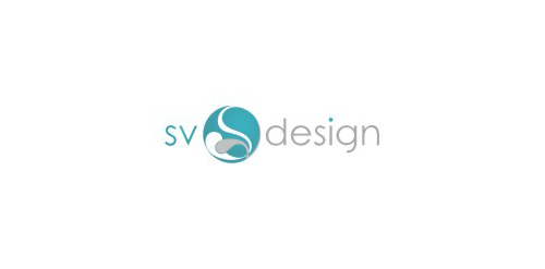
"S" and "V" letters within harmonising circle.
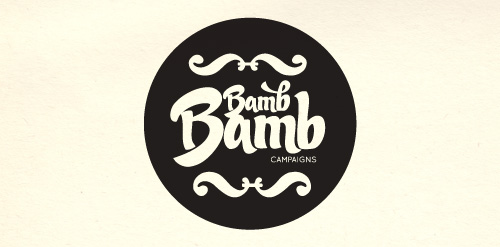
Bamb Bamb is a Campaign Management company based in Eastbourne, UK. Logo designed by Simple as Milk.
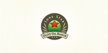
Logo and label design for a Texas based ranch that grows and sells their own olive oil.
Logo design for Paez Production, 2011. ||| http://inkbotdesign.com/2011/02/paez-production/
The word Zimzala is a surfing term, meaning "one who likes to keep their feet in the sand". We used a wave as a symbol for this marketing company's easy going style.
Our logo inspiration gallery will give you the creative boost you're looking for. Get your daily dose of logo design inspiration to work on your own logo design projects and get your business going. Be amazed by our logo designers and their brand guidelines. We are here to help you impress your clients and our fellow designers. Professionalize your logo design skills and get yourself to a new level. Browse our logo design gallery and discover all the new logo design trends and much more. We know you love logos!