
Corporate Identity logos (5)
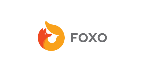
This is lovely fox logo design for "FOXO" and its construction. Icon simulates fox creating "O" – round, elegant & endless shape.


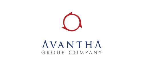
The symbol depicts continues movement, projecting progressive dynamism. The colour red brings out the passion and energy of the group while blue symbolizes stability and strength The three cogs on the logo signify the values of Integrity, Imagination and Individual

Self logo and identity of my face.
The Anagenix corporate identity was inspired by phyllotaxis which is an arrangement of crisscrossing spirals found in nature. The visual of this concept and everything Anagenix stands for has an interesting parallel of how they combine science with nature through innovation and discovery. The circles contained in the shape symbolise their brand values – the many partnerships, the scientific discipline, their expertise and trustworthiness. The colour palette was inspired by its NZ origins and nature. Looking at the world through this scientific lens of the phyllotaxis this identity has been designed to behave like a chameleon by taking on the form of the medium it is put on. It may applied with varying images from the NZ landscape and the natural products that may be in the pipeline. It may also be diecut to suggest the explorative nature of their business.
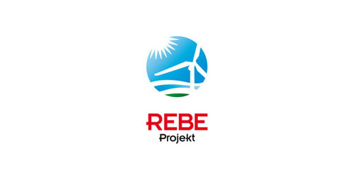
Cooperation between regions in the field of bioenergetics and energy transfer of knowledge. A project of Austria-Hungary Cross-Border Cooperation Programme 2007-2013 under the European Regional Development Fund, and Lower Austria, the province and the Republic of Hungary will be on display.
Our logo inspiration gallery will give you the creative boost you're looking for. Get your daily dose of logo design inspiration to work on your own logo design projects and get your business going. Be amazed by our logo designers and their brand guidelines. We are here to help you impress your clients and our fellow designers. Professionalize your logo design skills and get yourself to a new level. Browse our logo design gallery and discover all the new logo design trends and much more. We know you love logos!