Horse logos (46)


Logo

horse trainer
This product is a height quality horse bedding produced by the nature, the Swiss forests.

Logo design for kids clothes shop

logo for equine products company.

A simple and unique logo design showing a chess horse/knight with a hammer, sickle and star in the negative space. Unused proposal. For sale.
Natural Cosmetics Brand. For more information about the brand or further projects visit my profile at: http://www.upwork.com/o/profiles/users/_~01322354571058e06e/
Tag Line stamp featuring a Celtic horse. Designed for Kent Brewery.
Elegant horse silhouette logo. Unused proposal.

Montereale is a horse riding school located in Maniago, a little city in the North east border of Italy. The school represents a relaxing and friendly but modern and elegant as it is located in one of the most important regions Friuli Venezia Giulia’s river. Our job as brand developers was to create a personality where we could glorify traditional meeting between horse and nature. The work is rooted in an engineering and modern approach to our assigned tasks. We are interested in getting involved in a project from the beginning to the end; from the preliminary idea to its realisation. While working closely with the client towards a common purpose, we stay focused on the detail which makes the quality of our work.

Another logo for horse
We created a logo that present a proud figure of Polish hussars rider. Due to the purpose of the logo, which is related to embroidering it on clothes, we focused on minimalism. The logotype has been presented only the most characteristic elements of the hussars or a horse and a helmet with wings. Thanks to that we avoided the splendor that disturb the brand communication with the client.
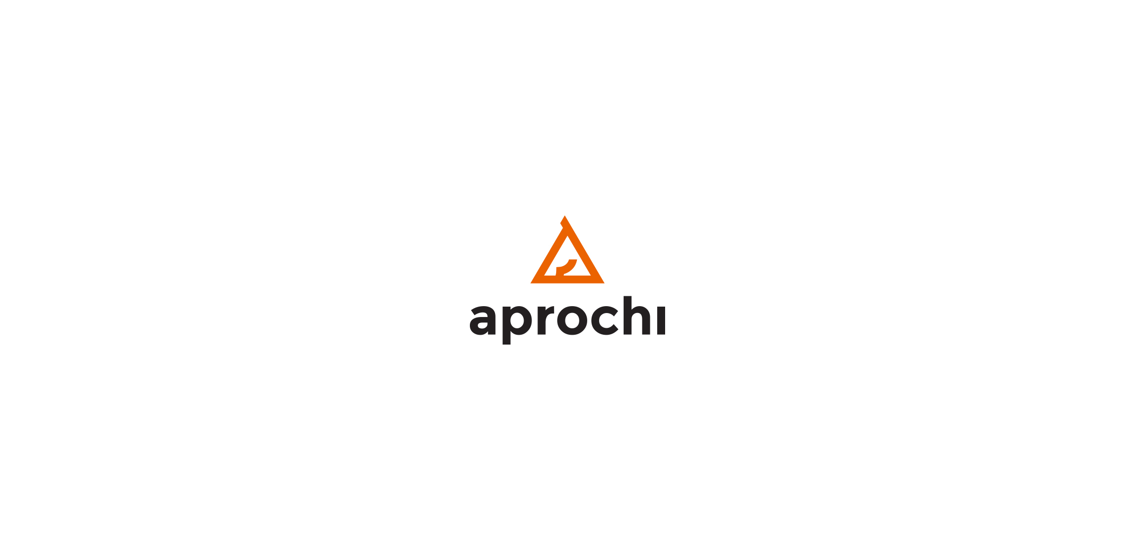
Aprochi - Premium horse feed brand. Elegant and minimalistic form of horse head in signet.

I created the logo for the national horse fair, worked in the little details to make it look like a horse.

CST is a training company. Symbolism of a chess knight is central to CSTs strategy. It exemplifies dynamism and initiative. Basing on these qualities and the target group in part the automotive branch I have referred in the lettering and composition to the aesthetics of sport cars emblems. Over the course of many sketches, I have created a convincing, minimalistic silhouette. Rendered as negative space against a chess square, it creates a bold, cohesive and legible mark.

Like us on facebook: www.facebook.com/hunapstudio

Saint George fighting with the dragon.
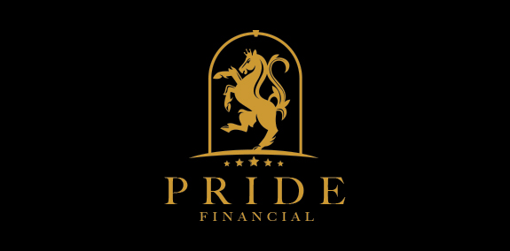
Prestigious rampant royal golden horse logo design. The horse is designed in a stylized and elegant style that creates a bold and modern look. The sophisticated horse is designed within an encompassing arch crest shape. https://www.logomood.com/downloads/rampant-royal-horse/
Logo for charity that supports local community with riding school. Also uses funding to rehabilite unwanted and abused horses. Based on old British tuppence coin with horse portrait.
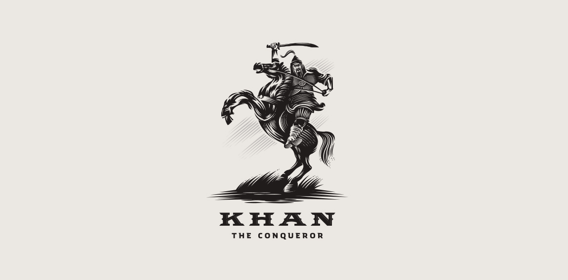
Khan the Conqueror

Latest work