
Square logos (37)
Logo design for an approved building inspector PRO Building Control.
We created a symbol based on an abstract building. A prominent square showing a fire escape route, in the form of a tick, was laid on top of an outlined square representing the solid foundations PRO work from.


FairApp Logo Design
A logo for web development company
Logo para brinquedo educativo.
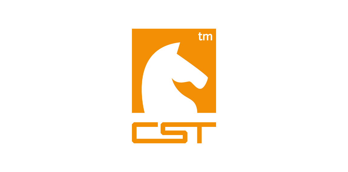
CST is a training company. Symbolism of a chess knight is central to CSTs strategy. It exemplifies dynamism and initiative. Basing on these qualities and the target group in part the automotive branch I have referred in the lettering and composition to the aesthetics of sport cars emblems. Over the course of many sketches, I have created a convincing, minimalistic silhouette. Rendered as negative space against a chess square, it creates a bold, cohesive and legible mark.
Logotype created for company manufacturing specialized adapters for photo & movie cameras. The logo is a combination of "C" letter and "7" in negative space. • • • Created for Motyf Studio • • • follow us on www.instagram.com/triptic.pl
https://dribbble.com/piotrlogo
"Vuông in Vietnamese means Square" Vuong was born in 2010, it came from the passion of art and crafts produced by a passionate artist classic definition of paper, leather and fabric. Wishing to transmit classical values combined with modern designs. Vuong developed models with rich materials from papers, leather and fabrics for applications of daily handmade products. 2013, Vuong created its own Fanpage, with a desire to become a place to serve people in a friendlier and more attentive way.
Logo design for university housing project by combining a house and mortarboard shape to create one image of a home.
Logo prepared for a logo competition for the Centre for the Meeting of Cultures in Lublin, Poland. More in the presentation: https://www.behance.net/gallery/27609749/Logo-for-Centre-for-the-Meeting-of-Cultures
Photography
GaleriaCSS is a social media website for webdevelopers. Logo shows letters CSS composed in a cascade which is relative to CSS acronym (cascade style sheets). It also shows a painting which associates with a gallery.
RUBIC
Worldwide photography tours and workshops.
The Food and Beverage Association of America is dedicated to promoting and advancing friendly relations between members, encouraging continuing education, assisting in career growth, providing industry-related scholarships, and providing philanthropic support for critical social issues.
Personal branding.
Square Egg, Squegg!
A logo for furniture company. It shows crown + M letter.
Minternet, is the Web Design and Development company from Mike Munro. The logo has been designed to represent communication and collaboration between developer and client to create a diamond product. Within the negative space, directional arrows split to represent web development.
Logo for a new independent film studio/production company.
Nowe Kompetencje (eng. New Competences) is a training group, which provides its services in the business sector.
Logo For neighborhood bar.
logo conception
Our logo inspiration gallery will give you the creative boost you're looking for. Get your daily dose of logo design inspiration to work on your own logo design projects and get your business going. Be amazed by our logo designers and their brand guidelines. We are here to help you impress your clients and our fellow designers. Professionalize your logo design skills and get yourself to a new level. Browse our logo design gallery and discover all the new logo design trends and much more. We know you love logos!