
University logos (14)
Contest entry for Sofia University brand design


Logo para Universidade. . Logo for university school.

Logo design for university housing project by combining a house and mortarboard shape to create one image of a home.
Logo for University Pharmacy. Letters A (for Apteka - means pharmacy in polish) and U (for University) creates an icon of a pill. The cross in upper right means medical connection of the icon but also express high quality of service by association with letter A. In result: A plus.
Cartoon, nice logo.
Logo designed for the Cheer Association of La Trobe University, Bendigo. Inspired by the typography and graphics of traditional university level sporting teams.
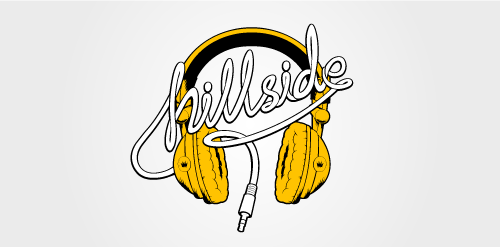
From a series of logos designed for Residential Services for university students. Each logo was inspired by an element of the traditionally youthful and relaxed student lifestyle. The 'Hillside' logo pays tribute to headphones, often considered to be a fundamental student accessory to motivate work ethic. Sometimes listening to a favourite band or album is necessary to focus and switch the mind into study mode.
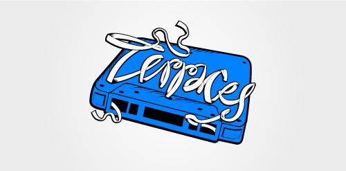
From a series of logos designed for Residential Services for university students. Each logo was inspired by an element of the traditionally youthful and relaxed student lifestyle. The 'Terraces' logo pays tribute to the cassette mixtape, which once played a huge part in the discovery of an individual's musical taste. Favourite songs were recorded on mixtapes and often shared amongst friends during their formative student years.
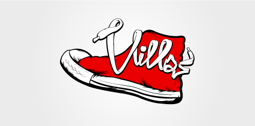
From a series of logos designed for Residential Services for university students. Each logo was inspired by an element of the traditionally youthful and relaxed student lifestyle. The 'Villas' logo pays tribute to the legendary Converse All Star, an iconic shoe design popular amongst students.

A private education publishing company launches a new website, "Online Degree Completion", to cover issues around going back to school to complete Bachelor's degrees.
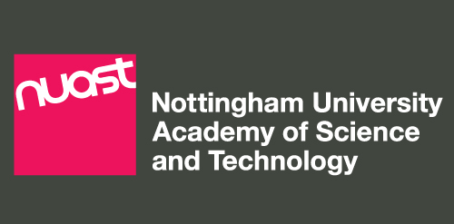
Part of new brand identity for the Nottingham University Academy of Science and Technology (NUAST), based in Nottingham UK. This is the landscape version. An option B exists which is in the Pantone 206 colour and is used on a white background. A square version is also used.
MBA | University of Life
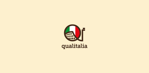
A logo made for a very original (and small) italian language school in Warsaw / Poland. I wanted to keep it simple. The 'qi' letters stand for 'quality' and 'italy'.
"Friends" is a community of students at pharmacy college in zagazig university that help others in their study by providing most of all the necessary materials, instruments and books that they need......also they do some other student activities in many fields .
Our logo inspiration gallery will give you the creative boost you're looking for. Get your daily dose of logo design inspiration to work on your own logo design projects and get your business going. Be amazed by our logo designers and their brand guidelines. We are here to help you impress your clients and our fellow designers. Professionalize your logo design skills and get yourself to a new level. Browse our logo design gallery and discover all the new logo design trends and much more. We know you love logos!