
February 2011 logos (158)
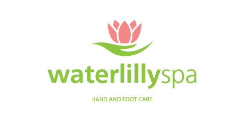
WaterlillySpa is a beauty salon in Athens, Greece, which is specialized in hand and foot care.
The source of inspiration is the actual waterlilly flower. The green leaf looks like a woman's hand holding the flower.
The logo combines softness and care and it uses fresh colors.


Logo I designed for fun.
Logotype for shoes company

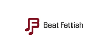
Logo for a social media website called Beat Fettish. It's going to be a place where little known producers and songwriters can go to post and sell their products. "F" is in the negative space.

Logo for some internet SMS service

This logo was created for fun. Inspiration: fresh and pure mountain wellspring. Elements: water drops, letter "M" hiding behind the drops, three drops has a shape of mountain, white space between the drops looks like wellspring.

Bar logo for fun!
логотип для магазина постельных принадлежностей
logo design for an organic fast food company.
Logotype for website about Sochi town
This logo was made for an event Management company
Fall 7 times and get up 8 times, is a japanese saying, that has inspired this logo. The logo is for a photographer based in Canada.
cyclic music event
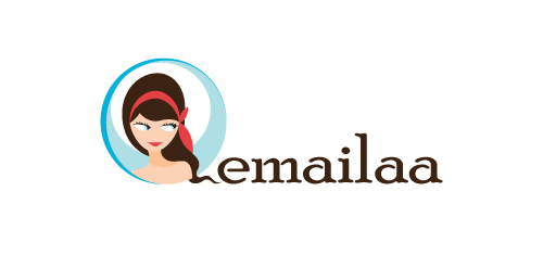
emailaa, beautiful newsletter designs
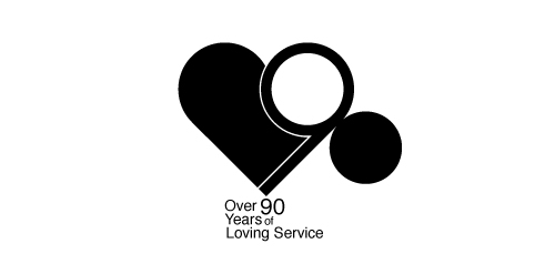
90 anniversary design for local business
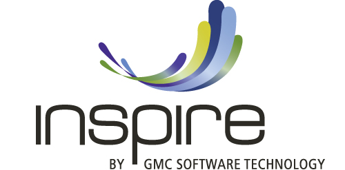
GMC Software Technology develops innovative software solutions for personalized customer communications. Their market is fundamentally changing from print communication to multi-channel output on eletronic devices. In order to meet the new market trends, the swiss-based company is introducing a new solution named «Inspire» . The logo with the swinging, colorful stripes was designed to express how the software solution creates powerful customer contacts, delivering personlised messages on multiple channels.
Ioannis Panagopoulos is a Software Engineeer.
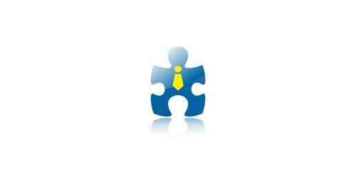
“The missing piece” of a puzzle was the concept for the symbol of this identity. As a result, a “human-lookalike” symbol was created based on a piece of puzzle, to show that without it, a project cannot be completed.
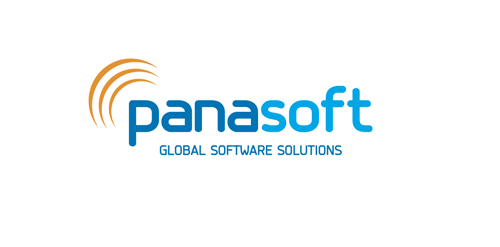
Logo for a travel software solutions company, based in Athens.
Aristea Kostopoulou is a professional masseuse based in Athens. She provides services at one's home such as reflexology, therapeutic massage, relaxing massage, reiki and more..
The inspiration of this logo was the great love that Aristea has for her work and the "magic" that she provides with her hands!
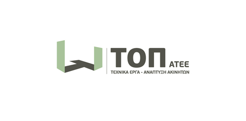
The inspiration of the identity of this construction company was the actual foundations of a building under construction.
A 3-dimentional symbol was created based on letter “T” (The initial letter of the company’s name) as the base of the construction, expressing the company’s values, such as trust, accuracy and professionalism.
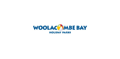
The logo endeavours to encapsulate the feeling of holiday parks in North Devon, the joviality of camping and caravanning for all the family. Woolacombe
Logo for climatic equipment
Logo for some service.. I don't know which )
logo for paintballing club
Our logo inspiration gallery will give you the creative boost you're looking for. Get your daily dose of logo design inspiration to work on your own logo design projects and get your business going. Be amazed by our logo designers and their brand guidelines. We are here to help you impress your clients and our fellow designers. Professionalize your logo design skills and get yourself to a new level. Browse our logo design gallery and discover all the new logo design trends and much more. We know you love logos!