
July 2011 logos (190)

Record Label


Auto Maintenance, the customer wanted to build a solid corporate image and a dynamic, rapidly discharging its duties. At the same time the character had a bump in the eye and be an attractive gadget ad, which the driver wishes to put on his car.

Done as a school assignment. Proposed logo redesign for Think Coffee - a chain of coffee houses in NYC (www.thinkcoffeenyc.com/) The logo reflects the name of the company by breaking it down to the simplest images. It shows the company's emphasis on thinking about ethical origins of its coffee, and the company's main clientele - college students whose brains cannot function without coffee.

THIS LOGOTYPE IS FOR REAL ESTATE
security & detective agency
Developed for a series of self-enrichment events entitled "Choose Love," this logotype was created to be instantly recognizable, whimsical, and inspirational. By stacking the eventʼs name and carefully editing key letterforms to maintain legibility, a heart appears to connect the words ‘choose’ and ‘love,’ bringing emphasis to the eventʼs mission.
The Choose Love experience combines a variety of creative exploration sessions, guided meditation, and yoga to help participants gain personal insight. The visual campaign included the development of the Choose Love brandmark, promotional poster, and event branded buttons distributed to participants.
© Keith Kitz, All rights reserved.
Place for little artists, scientist and fun lovers.
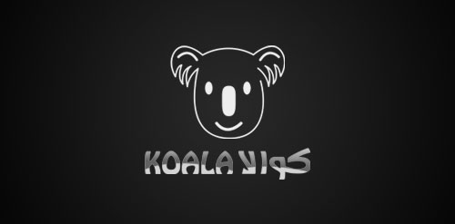
the koala is a new logo for my design
Pixel is a cartoon strip I developed. http://www.facebook.com/Pixelogram
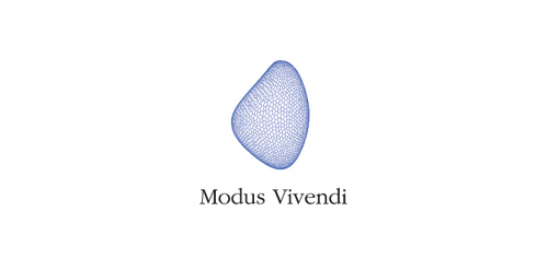
Modus Vivendi are distributors of wellness products. Modus Vivendi means 'a way of life'
Firebrand is a Christian church.
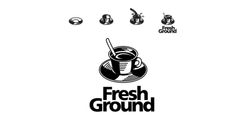
FreshGround is a fun and focused coffee shop. The focus is simple, good coffee.
New logo for Leene Mogobe. Online portfolio coming soon!
New brand identity.
Logo do evento Mocidades no Cinema
Logo Mocidades no Cinema(Youth in Film) Event
Propostas de Logo para OSRJ(Orquestra de Solistas do Rio de Janeiro)
Proposed Logo for OSRJ (Soloists Orchestra in Rio de Janeiro)

Logo design for a company that runs a platform that lets companies post challenges that a user base can solve.
Assembling of excavators
Huge Movie Box. High quality. Huge Collection
logo for a female apparel online store.. a custom type arrangement..
free work.
for energy drink company in turkey.
Logo for spin-out company dedicated to the professional preparation of EU projects. Logo symbolizes letter F and man raising hand.
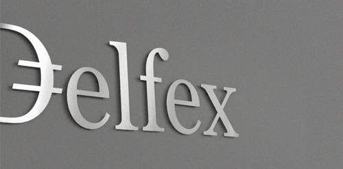
Logo and corporate identity for company trading with foreign currency. I was working on this project last two month. I made for client whole identity set from logo design, stationery design, web design with programming part, copy-writing including slogan and finally design manual. Logo on this photo is mounted in headquarters office on a wall. It was carved out of brushed aluminum plate to gain metallic look which is symbolic interpretation of currency, money and prosperity. Metallic effect literally connects whole identity. All stationery is printed by PANTONE 811 C metallic silver color. For selected materials such as business cards, compliment cards, envelopes and documents folder was used special silver metallic paper.
Our logo inspiration gallery will give you the creative boost you're looking for. Get your daily dose of logo design inspiration to work on your own logo design projects and get your business going. Be amazed by our logo designers and their brand guidelines. We are here to help you impress your clients and our fellow designers. Professionalize your logo design skills and get yourself to a new level. Browse our logo design gallery and discover all the new logo design trends and much more. We know you love logos!