
September 2011 logos (206)
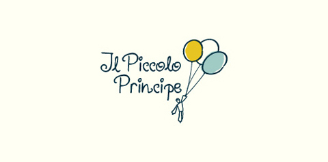
This logo was designed for a university project. Through the metaphor of flight is the name of "The Little Prince" for which it was made. Gross and childish features were used in order to emphasize the purpose of the association: to help disadvantaged children.


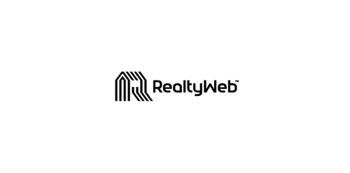
Approved logodesign for Realtyweb.com Custom made Typography. RealtyWeb.com combines 3rd party data and information on close to 30,000 state and local real estate markets to help the consumer and the real estate professional make educated decisions.
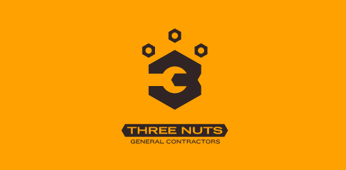
This logo is for a completely fictitious entity named Three Nuts General Contractors.
The idea for this brand came to me when I was out and about in the world, and saw a contractor's work van drive by. As I looked at the number 3 in the telephone number on the van, I started thinking about how a cleverly constructed 3 could reveal a wrench in negative space.
Using a hexagonal bolt nut as my main source of inspiration, I thought of a whimsical name which would support the concept I had in mind. In this hypothetical situation, the "Three Nuts" could be a team of three general contractors.
The icon is built from the angles of the bolt nut, and the entire mark should evoke a heavy industrial feel; something that could be stamped into metal, etched into wood, or simply affixed on the side of a work van.
Click here to see the case study for this logo, which chronicles its development, and includes full design rationale, sketches, electronic roughs, and alternate designs.
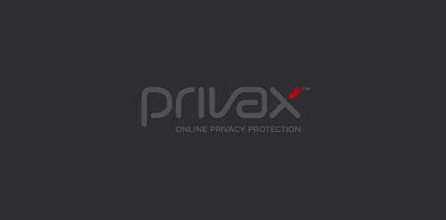
For a VPN Service (virtual private network) named Privax which helps secure your internet connection + helps protect your online anonymity through encryption. Custom made font. The concept: the x symbolize an abstract protective shield with which you surf anonymously, the red bar is the outside world / hacker etc...
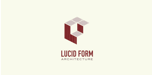
This logo is for a completely fictitious architecture studio called Lucid Form Architecture.
The icon is based on an optical illusion of a cube within a cube. Primarily, the form depicts a big cube, made of wood walls and metal-plated top surfaces, with a notch cut out of the center, resulting in a 3-D "L" shape. However, the longer one looks at this, perception begins to shift, resulting in a couple of different interpretations: 1) a small cube with a wooden wall and metal-plated bottom, in the corner of a room, hovering near the top of a tiled ceiling; 2) a room, tilted 90° clockwise, with hardwood floors, tiled walls, and a cube with a wood countertop and metal-plated side on the floor in the corner. This perception shift is important to the name, because it presents an ironic twist. To make "lucid" means to make clear, and while the icon seems to initially baffle and confuse, it ultimately encourages the viewer to challenge his or her preconceived notions of "perception." So too is the Lucid Form methodology for creating seeming impossible structures.
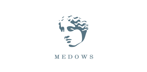
MEDOWS is fresh modern dynamic brand with short easy memorable name. It will suite well to any business or industry.
a concept logo designed.
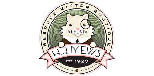
New logo for HJ Mews - an online retailer of the finest cat products and accessories. Logo features a very handsome kitty cat, with distinguishing taste!
A simple 'C' mark.
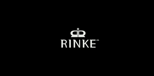
RINKE Monogram which shows also a crown to convey a luxury. This was a rebranding from Rinke Design Limited to just RINKE. Rinke has a huge range of world class luxury furniture of classic & contemporary - modern styles in store and online. Rinke also carries a range of beautifully handcrafted NZ made pieces which complements its commitment to retailing high end NZ made furniture.
Well the idea is pretty clear.
Logo for the girl who is engaged PHOTOART, web design and illustration.
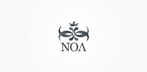
NOA – glam / electronic music club.
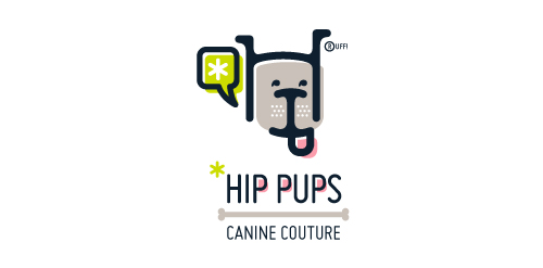
This fictitious company logo is the result of happenstance typographic exploration. I was playing around with H and I letterforms set in Platelet, and, after placing the I within the H, I noticed that it started to look like a dog face. After some modification, and with the addition of a curved P for an extended dog tongue, the resulting typographic illustration spelled "HIP." I thought it would be fun to name this fictitious company Hip Pups, which could be a shop that sells high-end dog accessories. The Registered symbol is integrated creatively into the mark by spelling "RUFF!"
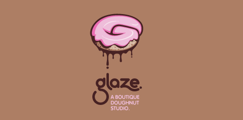
This is a totally fictional company that I refer to as "a boutique doughnut studio." I envision it as a trendy, metropolitan bakery that allows customers to glaze and decorate their own unique doughnuts. I wanted this to look really tactile, gooey, and sweet - like you really want to take a bite. Type for "glaze" is custom, and reflects the roundness of a doughnut. Click here to view my Flickr stream for full design rationale and additional images.
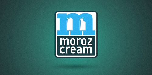
Ice-cream retail
A logo for a company producing equipment for chemical laboratories.
Hello wordmark with a custom typography.
School project of a food company.
Personal logo. My short name (:
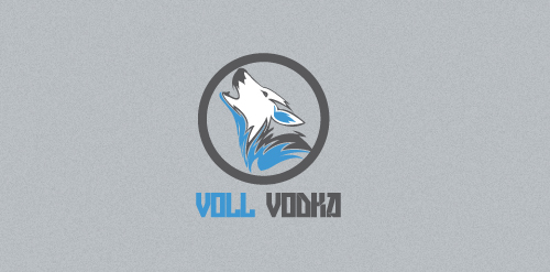
Another school project. This time, a fake brand of Vodka. I'm in love with wolves (:
The second in hand logo for the project.
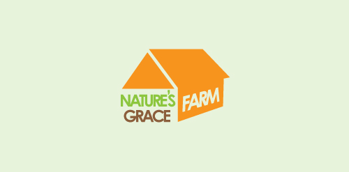
Project for school. Fake brand of organic products. This was the one Ms. Teacher chose.
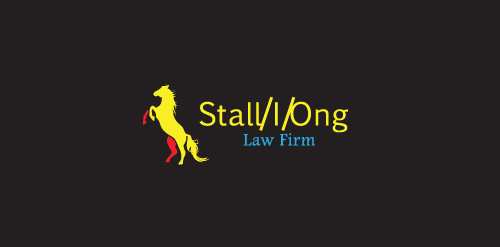
Another project. This time, a law firm with a name puzzle, think you can find it?
Our logo inspiration gallery will give you the creative boost you're looking for. Get your daily dose of logo design inspiration to work on your own logo design projects and get your business going. Be amazed by our logo designers and their brand guidelines. We are here to help you impress your clients and our fellow designers. Professionalize your logo design skills and get yourself to a new level. Browse our logo design gallery and discover all the new logo design trends and much more. We know you love logos!