
November 2011 logos (153)
Cooperation between regions in the field of bioenergetics and energy transfer of knowledge. A project of Austria-Hungary Cross-Border Cooperation Programme 2007-2013 under the European Regional Development Fund, and Lower Austria, the province and the Republic of Hungary will be on display.


Work project - 2011
This I did for my current job, an internal-circulation digital magazine to help promote inter-disciplinary camaraderie, conscientious appreciation of all currentblah blah corporate pep-talk blah.
Yeah... the name (which means Behind the Books in English) comes from the idea of trying to get workers to appreciate all the work that goes into the making of the elementary and junior high grade level books we make; which actually IS a pretty good idea :P
logotype for date portal based on searching partners fitting to quick quiz answers.
Logo for our up and coming shirts/prints/design shop. Crazy excited, we launch in January so keep a look out www.loudlion.us
Stylized spartan helmet with sword inside
This is a logo for a company which specializes in transport logistics.
logo for a line of baby shampoo and soothing soaps.

This is a logo for a company that provides comprehensive financial services.

I was asked to make a logo for a customer who is starting a company called iClick.

Zip Wine
Smart Repair is a directory for nearly all companies serving the german smart repairs market. Within the enduser can find the most nearby specialist for his problem and also lots of informative tips and tricks, articles, glossary etc. about smart repair.
Logo for the 'Festival of Arts and Multiculturalism'.
Logo for a company that provides solutions and apps for facebook, iPhone, android and other platforms.
Logo for furniture makers. The concept is wood shaving from ex. a wood chisel creating the letter Ø. Woodcut style illustration so the details will be visible when etched or burned into wood.
Oсновным фирменным цветом является коричневый цвет, близкий к шоколадному. Ключевые значения и символика коричневого цвета – «мать-Земля, дающая жизнь всему живому», «надежность», «трудолюбие», «преданность». Основа логотипа – это образ дерева, которое дает потребителям чувства уверенности, устойчивости, силы, вечности. Объединение коричневого и бежевого цветов воспринимается потребителями как энергетически сильное, поддерживающее чувство «уверенность в завтрашнем дне». Дополнительный серый (платиновый) цвет добавляет образу бренда такие черты, как «сдержанная роскошь» и «прагматизм».
Батьківщина МОЛОДА
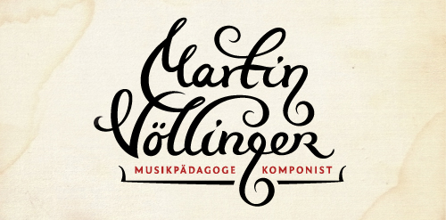
Logo design for composer, music pedagog, organist and conductor. The "g" letter is made to look like violin key. The client wanted happy and joyful look but still to represent proffesional musician.
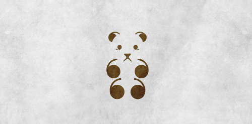
Bear quotes
This is a logo i've created for a company that deliver gifts in special boxes full of susprises and cool stuff!
Once I've noticed one fairy tale book on my shelf and thought it could be interesting to play with. Just a fun idea, no more no less.
/
CupCakes
Logo for a company export region,terroir product. The sails of the boat form a W or W form sails ;]
Octty Type
Our logo inspiration gallery will give you the creative boost you're looking for. Get your daily dose of logo design inspiration to work on your own logo design projects and get your business going. Be amazed by our logo designers and their brand guidelines. We are here to help you impress your clients and our fellow designers. Professionalize your logo design skills and get yourself to a new level. Browse our logo design gallery and discover all the new logo design trends and much more. We know you love logos!