
June 2012 logos (143)
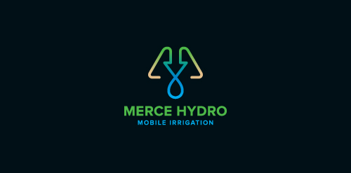
Merce Hydro, a mobile irrigation company based in Northern Victoria, Australia specialise in redevelopment of drought effected areas for the purpose of farming & residential properties. The Mark is based on the use of a water drop, an arrow, pipes & finished off with an M. The arrow symbolises function & the arrow/drop cross section symbolises design - both core factors in engineering & invention of their systems. Green represents growth, their aim. Brown represents destination (drought area) their market. Water represents sustainabilty, their long term plan, and finally the pipe represents management, their ongoing analysis & monitoring of their network.


Logo of gifts delivery service.

logo for clothing brand
a custom typography work rejected by the client who insisted on doing a logo with calibri font and a black box behind it :|
seals and stamps
.

Personal Logo for Comedian Bob Smiley.
Logo for haberdashery in Poland, skein + A
Web Design Studio
Owl
Wee planets website
Local, independent book-keeping company.
Company for the carriage of goods
Logo design for boutique cake makers in Cambridge, UK. House of Cake
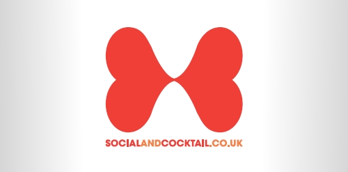
The logo is for the cocktails website socialandcocktail.co.uk. An adaptable logo with multiple colourways, it features two connected hearts designed to mimic the bow-tie of a cocktail waiter. The negative space also implies the shape of a two-sided spirits measuring tool popular in the industry.
This Logo design is created using Photoshop Illustrator CorelDraw for art company.
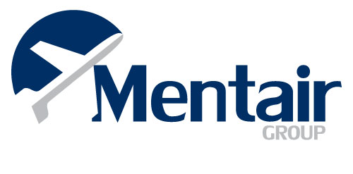
This was part of a branding project for a company launched in 2012. Mentair offers safety services and "mentoring" to the aviation industry.
Milovac design
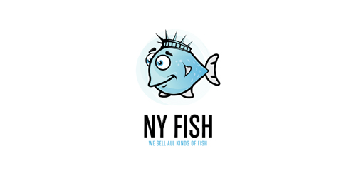
New York Fish logo, was designed for any company, dealing with fish selling, or any other kind of fish food. You can see the "crown" of statue of Liberty city in NY, and illustrated fish - New York Fish.
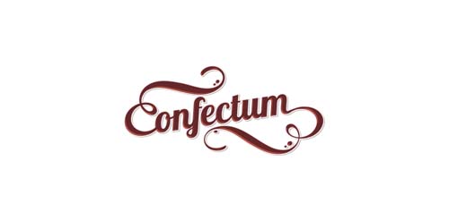
Confectionery сompany
Submission for a contest.
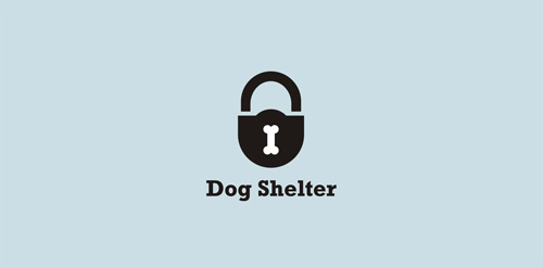
Simple and strong logo for dog shelter.
Cathijane - custom typo logo for a web design studio
Logo for Neck
Our logo inspiration gallery will give you the creative boost you're looking for. Get your daily dose of logo design inspiration to work on your own logo design projects and get your business going. Be amazed by our logo designers and their brand guidelines. We are here to help you impress your clients and our fellow designers. Professionalize your logo design skills and get yourself to a new level. Browse our logo design gallery and discover all the new logo design trends and much more. We know you love logos!