
April 2013 logos (146)

WILFREDON is fresh modern dynamic brand with short easy memorable name. It will suite well to any business or industry


Logo for geodetic company in Czech rep.
never give up.
Inspection Support Network is an online "software as a service" for home inspectors. The icon is made out of all three first letters of the name ISN. Companies official website: http://www.inspectionsupport.net/
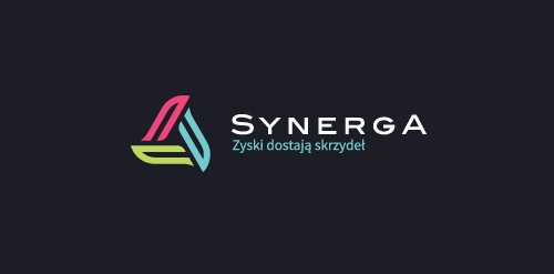
"Synerga"is a company operates on renewable energy market which is currently one of the most lucrative and safe investment fields in Poland. In its offer gives an opportunity to invest in wind farms built by themselves and share in the profits earned by them. Our task was to prepare a comprehensive visual identity through which the company will become the image of a professional and reliable partner in the investment on a large scale and to strengthen its position in the market.
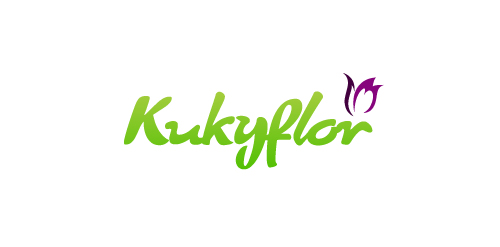
The logo was designed for a Online Flower Shop. They will send flowers to your loved one directly to her/his house when you order online. This logo tries to reflect the freshness of the flowers and the products that "Kukyflor" offers. The typography of the logo was redesign to give the sensation of petals forming the word "kukyflor".
A light logo design
A logo for an aloe vera drink. http://www.facebook.com/drinksuperleaf
Gifts
Decoration In Saudi Arabia
MBA | University of Life
Pacific TG is a group of two company, General Shipping Ltd is part of Trading Group, and other part is ATF LLC is Transportation Group in Russia. For a number of years they has been delivering different types of goods from Asian countries (like VietNam, Japan, etc) to the Russian market. The short name is: PTG. It is deciphered as Pacific TG - last later deciphered: Trading Group and Transport Group. The container is the main key and main inspiration for the whole brand.
Imperial Seafood is a sea food restaurant, a part of The Aqua Group.
The Aqua Group is a F&B business (Restaurant and Entertainment Management Group).
Princess Bridal is wedding studio in Viet Nam.
Innovations IT is small business, headquartered in Canada. They are professional working with best solution in Information Technology for hi tech products such as laptop, desktop and mobile phone.
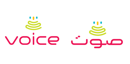
Developed for a speech therapist & vocal coach based in UAE, I have developed both a Latin & Arabic typographic solution (see variations). Concept here is 'fun with pitch' - the green swirl represents travelling soundwaves, the yellow bar represents the golden note (or perfect pitch) with the blue bars representing the plus/minus discrepancy, so it’s about precision. There is also an implied smiley face, can you see it?
My personal logo redesigned to show that the ideas out of me are mind blowing
Logo made for a production house
Entry for a logo competition for the famous dubstep dj Rusko
Book publisher, publishes books on cooking
Logo for advertising agency.
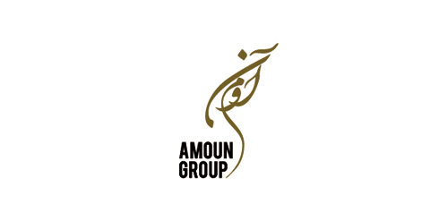
Final logo for Amoun Group.. Amoun Group included a hotel, oriental restaurant travel agency, programing agancy & an advertising agancy.. The logo reflect all themes of those companies, Arabic theme (letters) and ancient Egyptian theme (the shape looks like Horus Eye)...
Our logo inspiration gallery will give you the creative boost you're looking for. Get your daily dose of logo design inspiration to work on your own logo design projects and get your business going. Be amazed by our logo designers and their brand guidelines. We are here to help you impress your clients and our fellow designers. Professionalize your logo design skills and get yourself to a new level. Browse our logo design gallery and discover all the new logo design trends and much more. We know you love logos!