
November 2013 logos (123)
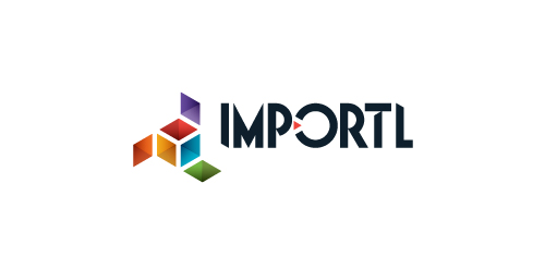
This is a logo for a completely fictitious entity named IMPORTL, which could be an open source web development site, or some type of developer software.
The idea is that the triangular facets form a series of open holes, or "portals," in multidimensional space. The central facets can also be seen to form a cube which is open on three sides. Lying before each opening is another opening on that side's respective "floor," yet, in an Escher-like paradox, where spatial orientation is an irrelevant construct, there is no floor. There is no up, down, left, right, back, or forth. This hyperspatial environment suggests infinite possibilities for the arrangement, manipulation, and exchange of data.
For color, the idea is that the primary colors that form the central cube beget the secondary colors that rotate outward, suggesting expansion, transformation, evolution.
The mark employs a custom typeface that compliments the angularity of the mark.
Click here to see the case study for this logo, which chronicles its development, and includes full design rationale, sketches, electronic roughs, and alternate designs.


Moonlight Brunch is a new film & television production New York City company that would like a logo with a light source - preferably not a moon, but the light the moon would be shedding. Creative brief: no moon, no film cans, film sprockets, film cameras. No diner or diner food. :)
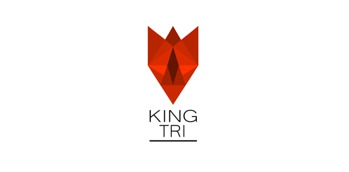
Logo design for a company that sells products from wood for health and beauty
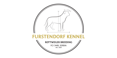
Rottweiler breeding logo. I wanted to represent that the breeders dogs are based on standards of A.D.R.K. (allgemeiner deutscher rottweiler klub). Important lines of the dog are bolded. The brown/gold color represents the color on rottweiler and also a champion/winner. Circle stands for golden medal.
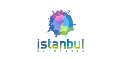
for panoramic wiew project.
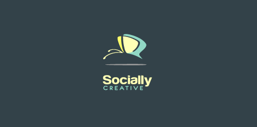
Logo design for social media management company
Identity project for a creative copywriter based in Santa Monica, California. The client wanted a bold wordmark that expressed innovation and creativity.
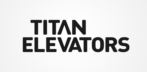
Titan Elevators needed a rebrand to showcase their offer. The logo was right under your nose; the up and down arrows of an elevator, simply made from the logotype's A and V.
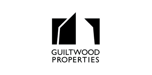
Guiltwood are developers of exclusive residential properties.

Championship of Poker
A company situated in Romania providing consulting services for other romanian companies which are planning to extend their business to Russian Federation.
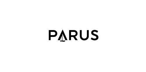
The name had to be clear and understandable in Russia. Parus means "sail" - a symbol of moving forward, development, direction, transport and logistics.
Logo design for a mobile app studio
The horizon brings about a reel of hipe while the red was used to depict a bright, glowing and rising organization
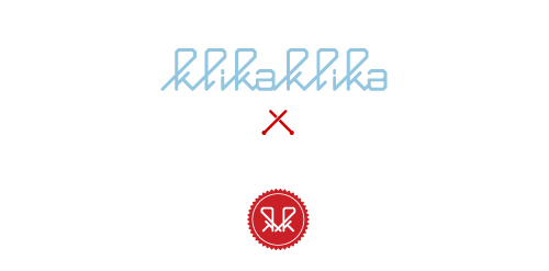
KlikaKlika satisfies the knitters needs
Arquitectura
Deporte y Artes Marciales
Local hand made soap & beauty care eco-natural products small bussines. - vintage designed elements -
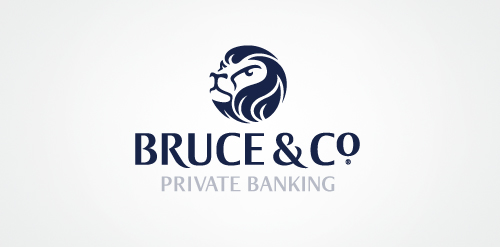
Bruce & Co is a Scottish private bank with a solid reputation of having good foresight and future planning. The lion marque derives from Scotland's oldest clan- the Bruce Clan, with the motto 'fuimus' (we have seen).
for wood carved mobile covers.
Logo for a local pet photographer. The client owns two Golden Retrievers, which were the inspiration for the mark.
Blogging about photography and stuff!
Logo for Evolving experience
3d Style log for render design
Got bored at work.
Our logo inspiration gallery will give you the creative boost you're looking for. Get your daily dose of logo design inspiration to work on your own logo design projects and get your business going. Be amazed by our logo designers and their brand guidelines. We are here to help you impress your clients and our fellow designers. Professionalize your logo design skills and get yourself to a new level. Browse our logo design gallery and discover all the new logo design trends and much more. We know you love logos!