December 2013 logos (128)
Expressive typography logo that presents 1/2. Made for fun.


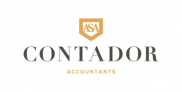
Logo for Contador Accountants based in Liverpool

Ready made logo design.


Most popular lifestyle portal in Slovakia and Czech Republic. Keeping you FRESH since 2011. The client approached me to redesign theirs logo. Refresher.sk need new logo that will reflect a primary activity. So I was looking for a way to simplify the logo, but also to have supported the idea and objectives of the portal. Gist for Logomark I chose symbol refresh, as you know for example, web browsers (symbol I wanted to get into logos peacefully and therefore I chose negative space), it is added to the symbol of conversation (bubble), which can be further used in communication portal (printed materials, merchandising, etc.), and the letter R. Scripture for the logo, I chose Helvetica. It is distinctive, timeless and elegant, expressing emotion is just FRESH :)

Internet portal - daily dose of motivation and inspiration for your healthy body and mind. Strength, diet, self esteem. When designing typography for the word "fitcult" I was inspired by the characteristics of the fitness (muscle, power, energy, dynamic). Custom lettering is a specific high contrast between horizontal and vertical strokes. The letter "f" and "i" are connected to the ligatures.
The client want it a Latter logo something luxury and elegant with the GP so our designer figure it out a unique and great way how to connect Those "GP" and the design got a luxury and modern touch. www.prowaystudios.com

Logo for Company handling the set up of fundraising events such as 5k runs
Retail store that sells summer apparel such as swimsuits as well as shorts and t-shirts
Logo for a Martini Bar at a local resort. I won an Addy award for this one.
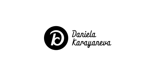
A logo monogram created from the first letters of company's name and, actually the owner's name.

Naming & logo for boutique cake bakery.

Ready made logo design.

Mara International Co. Logo

Roman Uliasz, behance. Logo for Roman Uliasz, lawyer. It shows shield (defense) + R (from Roman) I hope you enjoy!

Logo for company which sells board games. "6 oczek" - means 6 pips on a dice (in Polish). Also word "pip" means "eye" in Polish so it's a little wordplay :)

This is a logo for Window producing company
Logo that expresses smiled face within perfectly arranged letters in pixel grid. Rejected proposal.