
August 2014 logos (137)
Green Marketing PVT. LTD


Homemade Chocolates
Ladies Beauty Parlor
Logo for a Nigerian event photographer.
Business consultancy company
tattoo
Vegetable Shop
New general logo for an online Expert Witness Directory, incorporating a themed pictogram. A very challenging project, but immensely pleased with the result, as is the client, which always helps. Finding that 'apparently simple' solution proved painstaking, but when I look at the icon now, it looks so easy. Just create the Good Book/and or reference Directory out of the shape of a D, and place the left hand (giving oath etc) on it. Ta daaaa… Anything but ta daaaa tho. Fonts used for Witness Directory: Kefa II Pro Bold and tag-line: Zona Pro Italic, both purchased from Myfonts.
Logo for my personal branding for graphic design services.
Proposal of logo for body care products
play with my brand
Customizable Ready Made Logo Design at http://wp.me/s4571j-eaglemon
Gallotti Umbrellas, italian umbrella company corporate identity and logo design
The Thailand's automotive parts manufacturer (CNC)
A sample logo created in Illustrator.
Visual concept
.
Brand and logo redesign for the Harvest Bible Church Logo.
The main challenge was to somehow link in the notion of harvest with the uber symbolic cross whilst keeping this particular church logo free of the visual cliches that often accompany many church logos.
I was approached by the Harvest Bible Church after they had seen the general style of my existing logo portfolio, so this was also a determining factor with the design style. A clean, smart, well defined church logo design was what this client was seeking.
The idea you see is basically formed from the imperfect lines of a soon to be harvest field, but also draws on the idea of a recently ploughed field which sets the beginning and creation of the crop cycle.
The horizontal and vertical lines converge creating this square/hatched shape which provides for a meaningful link to that one place where people will ultimately converge: the church.
/
Logo creation for a photograph.
It's for a Spanish clone of mint.com called ahorroy.com. The logo represents the text of the mark "ahorro y punto", "ahorro" means "I save" and "y punto" is a Spanish expression meaning "end of history", and literally means "and point". So the logo is a piggy bank and a point. I applied dynamic strokes to represent innovation of the application. At the same time, simulates to be a face looking up and sticking out his tongue.
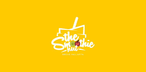
The Smoothie Hut is a 100% mexican establishment which is involved in the food/beverage industry. Developed in Nuevo Vallarta, Nayarit (MEX), this company comes to the market in order to promote the “Smoothie” culture, which involves the all-natural, healthy, fresh and high quality products, giving to our body the nutrients needed for optimal performance.
Tipico is a new concept of food. Restaurants based in the most important cities of the world and quality food products. We did a proposal for naming, logo, corporate identity, packaging and advertising.
An An hotel is located in District 1, Ho Chi Minh city. It has vintage glamour style and provides professional service in hotel and tourism.
Our logo inspiration gallery will give you the creative boost you're looking for. Get your daily dose of logo design inspiration to work on your own logo design projects and get your business going. Be amazed by our logo designers and their brand guidelines. We are here to help you impress your clients and our fellow designers. Professionalize your logo design skills and get yourself to a new level. Browse our logo design gallery and discover all the new logo design trends and much more. We know you love logos!