
August 2016 logos (67)
This logo was uploaded on 99designs.com The CH want for the logo that it oposite with the company name. It means not playful, just strong and simple. So this is logo I come up with. The reason why I upload this on here is for seeing any critique and suggestion. I'm sorry for my bad english. Thank you :)


Studio Copper is an american company that handcrafts genuine copper mugs that was born in 2015.
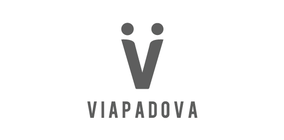
Once upon a time, the area known as Via Padova in Milan, Italy, had a less than salubrious reputation. Our project was to help change that image by creating a new identity for the area that would bring the various groups of people – or local tribes as we called them – together. We needed to represent Via Padova as a space that welcomed every one of its citizens – a challenging proposition. The city needed a visual system, a graphic identity that could organise and simplify communication with the people. We used the letter V to symbolise a handshake – and hence the union and coming together – of two people, symbolising a community coming together.
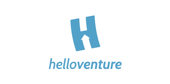
Hello Venture is an organisation that brings start-up communities together and creates spaces for entrepreneurs to learn and work. In this case, the brand identity that we created focuses on the letter H with an arrow inside to symbolise the progressive growing of the new enterprises. The H is flying up. The logotype is set in lowercase letters to emphasise the company’s humble and friendly approach. The colour scheme represents security and confidence. The result is a minimalist identity with customised typeface and flexible print material.
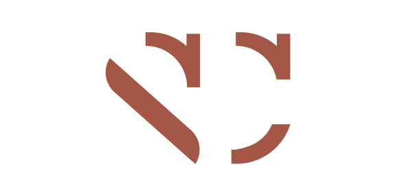
negativespace logo with an aim to convey what "risk" actually means
Healthy slow food brand
Quirky logo for a tea shop / manufacturer.
Borgund Stave Church (Norwegian: Borgund stavkyrkje) is a stave church located in the village of Borgund in the municipality of Lærdal in Sogn og Fjordane county, Norway. It is classified as a triple nave stave church of the so-called Sogn-type. This is also the best preserved of Norway's 28 extant stave churches.
Altermoto is an importer and distributor of high quality accessories for scooters and motorcycles. Logo design involves the use of parts of the letters to create the image of a two-wheeled vehicle. Minimalism makes it looks good on letterhead or on the screens of mobile phones.
Marca do tema para o Festival Internacional de Teatro de São José do Rio Preto - ano 2014
We created a logo that present a proud figure of Polish hussars rider. Due to the purpose of the logo, which is related to embroidering it on clothes, we focused on minimalism. The logotype has been presented only the most characteristic elements of the hussars or a horse and a helmet with wings. Thanks to that we avoided the splendor that disturb the brand communication with the client.
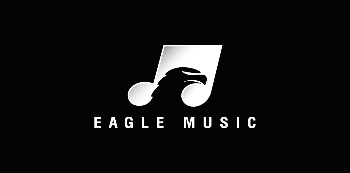
A nice and clever negative space logo featuring a musical note having an Eagle's head placed inside of it as hidden or negative space.
Cake company based in Krakow
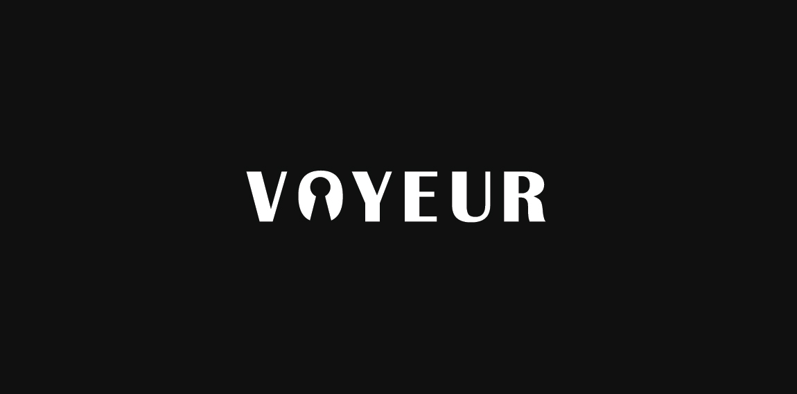
Voyeur concept
Mobile application logo design for CENN caucasus environmental NGO network. The app gives you an opportunity to reveal the facts that can be a threat to our environment. Weather you’re facing forest fire, forest degradation, illegal wood trading, pollution littering and more.
London based financial/capital company - approved version.
Four Suns Valley Logo design Bu Boldflower Design Studio
The logo depicts a balanced diet for good health. All the necessary food items that contain the important nutrients are displayed in the logo.
The logo is depicted in red and black colors. The hand prints and the sign of 'Om' give a religious and spiritual touch to the logo.
Our logo inspiration gallery will give you the creative boost you're looking for. Get your daily dose of logo design inspiration to work on your own logo design projects and get your business going. Be amazed by our logo designers and their brand guidelines. We are here to help you impress your clients and our fellow designers. Professionalize your logo design skills and get yourself to a new level. Browse our logo design gallery and discover all the new logo design trends and much more. We know you love logos!