Interested in this domain and website? Contact [email protected]

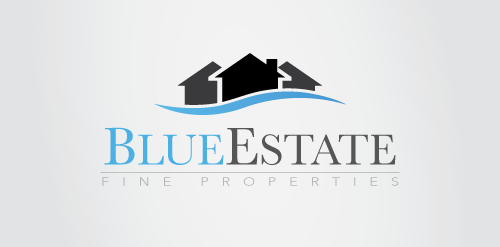
Blue Estate
Blue Estate


- Get unique ready made logos for $99.99
- Blue Estate logo design. Suitable for estate agencies.
- Submitted: 08/30/2013
- Stats: This logo design has 2128 views and is 0 times added to someone's favorites. It has 4 votes with an average of 3.25 out of 5.
Designer
Comments: 2
Leave a Reply


Our logo inspiration gallery will give you the creative boost you're looking for. Get your daily dose of logo design inspiration to work on your own logo design projects and get your business going. Be amazed by our logo designers and their brand guidelines. We are here to help you impress your clients and our fellow designers. Professionalize your logo design skills and get yourself to a new level. Browse our logo design gallery and discover all the new logo design trends and much more. We know you love logos!
Feels nice, but a little generic. Can you do something with the houses to stylize them a bit? To make them a little more unique and interesting? Also, “FINE PROPERTIES” should be a little heavier font or at least darker. I can barely read it.
One last thing: why the blue wave under the houses? Are the houses on water? Or are they houses on waterfront property?
Overall a balanced piece. Just needs some refining.
ReplyHi HerbyDerby,
ReplyThank you for your comment. Im I will do my best to make it better than is. That words under main text “FINE PROPERTIES” looks fine on my laptop. It probably depends of screen type. Anyway i will fix it. It must be good visible on all desktops. Also the blue colour is random. I just named it BlueEstates so this is the reason why I used blue colour for the wave. As you can notice, the houses are in greyscale colours so changing the wave colour should not be a problem. I think all colours will match the houses. Thanks again for your comment.
Best Regards