
Logo inspiration
Inspirational logos

CAR DASHBOARD APP


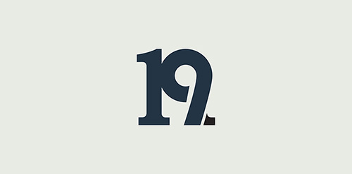
Designing a unique and bold mark for a student card for university students to receive discounts at food and drink venues. First concept I came up with. They want the 19 in the logo. WIP. Complete project on Behance: https://www.behance.net/gallery/16985931/Nineteen-Card
Logo for my design studio. Rode is croatian for stork!
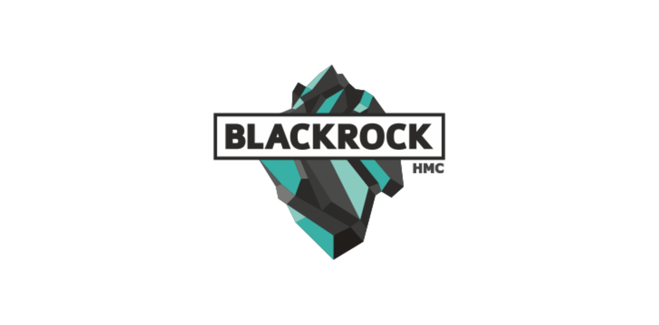
Creating logo for BLACKROCK - engineering and construction company that deals exclusively with medical institutions.
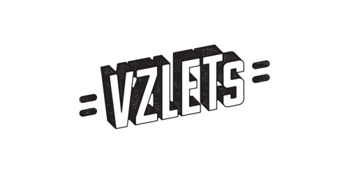
VZLETS is specialized on Internet promotion and Social Media Marketing. See more: http://logomachine.net/

Vietnam National Museum Of History
Logo Proposal
Logo perfect for lounge, bistro, bar or winery
Background screening intelligence
Radio Cafe
Ape Lu is a italian fashion boutique located in the most fashionable street in Warsaw/Poland. Ape means Bee in Italian and the client wanted it to be in the symbol. We wanted to keep it clean, elegant and modern.
logo for a professional graphic design studio based in mexico.

Development company «MS»
Logo idea for NAWF.
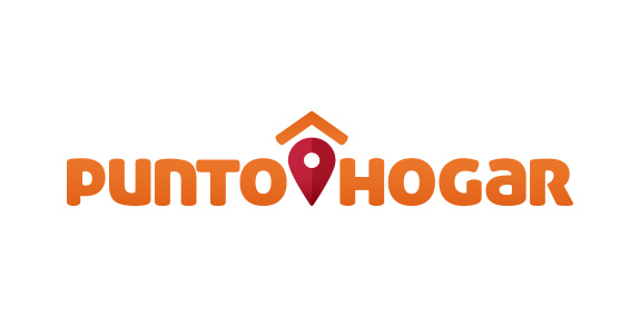
El concepto se trabajó en base al ‘’Pin’’ de ubicación, esto refiere a la búsqueda de un lugar. El triángulo inconcluso representa el techo de una casa, que también connota una flecha. Al juntar estos elementos se genera la idea que el hogar es donde todos llegamos.
Ticket shop.
☆ HONORS ☆

-
shtef-sokolovich
190 logos
-
Boldflower Design Studio
189 logos
-
Ailton Marques
115 logos
-
Light Rainer
114 logos
-
Alek • Triptic.pl
107 logos
-
almosh82
96 logos
-
sadany
96 logos
-
Duminda Perera
93 logos
-
pizelato™
91 logos
-
Aleksandar
91 logos

Recent comments
حسین:
please send me...
chirag_j:
Hello is the above issue resolved?...
mrgraphics:
great logo...
Aleksandar:
Thank you Gile!...
fraGile:
Thanks a lot!...
Marko Bulatovic:
Great work!...
Popular tags
Our logo inspiration gallery will give you the creative boost you're looking for. Get your daily dose of logo design inspiration to work on your own logo design projects and get your business going. Be amazed by our logo designers and their brand guidelines. We are here to help you impress your clients and our fellow designers. Professionalize your logo design skills and get yourself to a new level. Browse our logo design gallery and discover all the new logo design trends and much more. We know you love logos!