
Logo inspiration
Inspirational logos
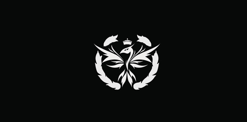
phoenix


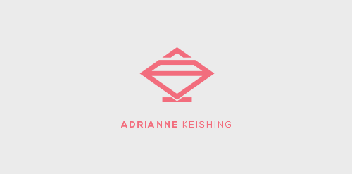
Adrianne Keishing is an up and coming fashion designer based in Delhi, India. She wanted to incorporate a diamond in the logo, while maintaining simplicity. This is a WIP.
ambigram horizontal
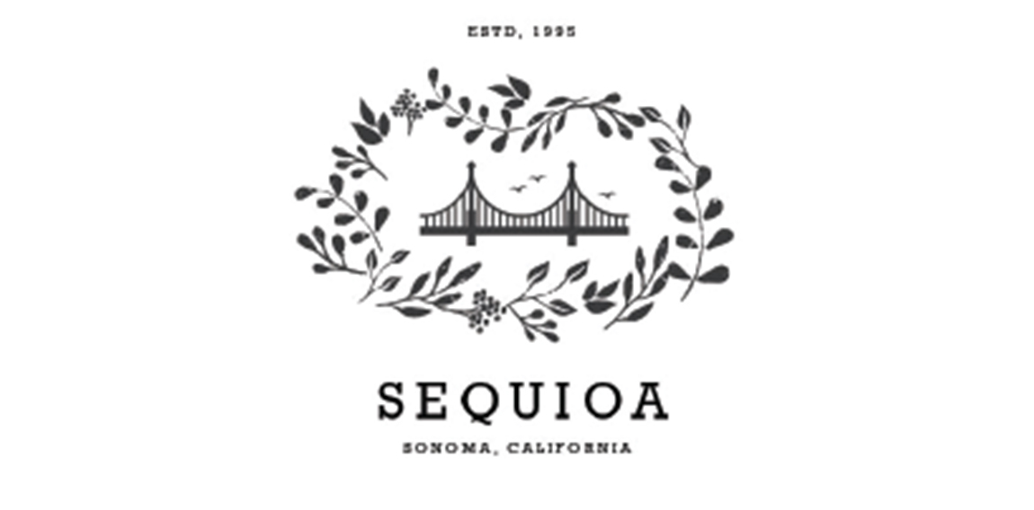
Sequioa
Beautiful logo with no limits in use.
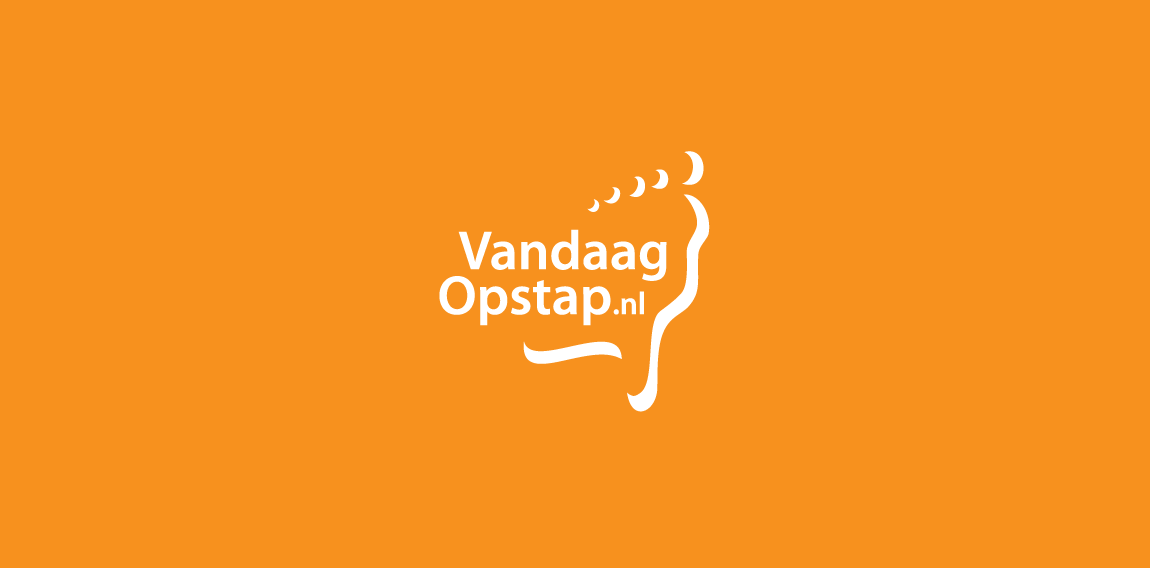
Logo design for a Dutch website that lists all day out trips from around the country. The logo is shaped by a foot and the outline of the Netherlands.
Created for fun only
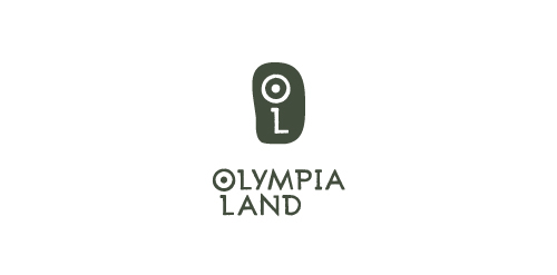
Olympia Land S.A. is a company that provides liveable experiences, cultural events and educational programs in Ancient Olympia, Greece. Services and programs include ancient Pentathlon reenactment, music festivals, trekking, mountain bike, rafting and more.. The inspiration of this logo was based on an old map of Ancient Olympia and the actual ruins of this holy venue.
Fun projects of mine
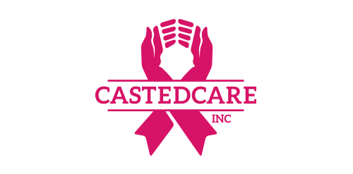
CastedCare provides onsite support to cancer patients. The logo uses the memorial ribbon with two hands in a supportive form
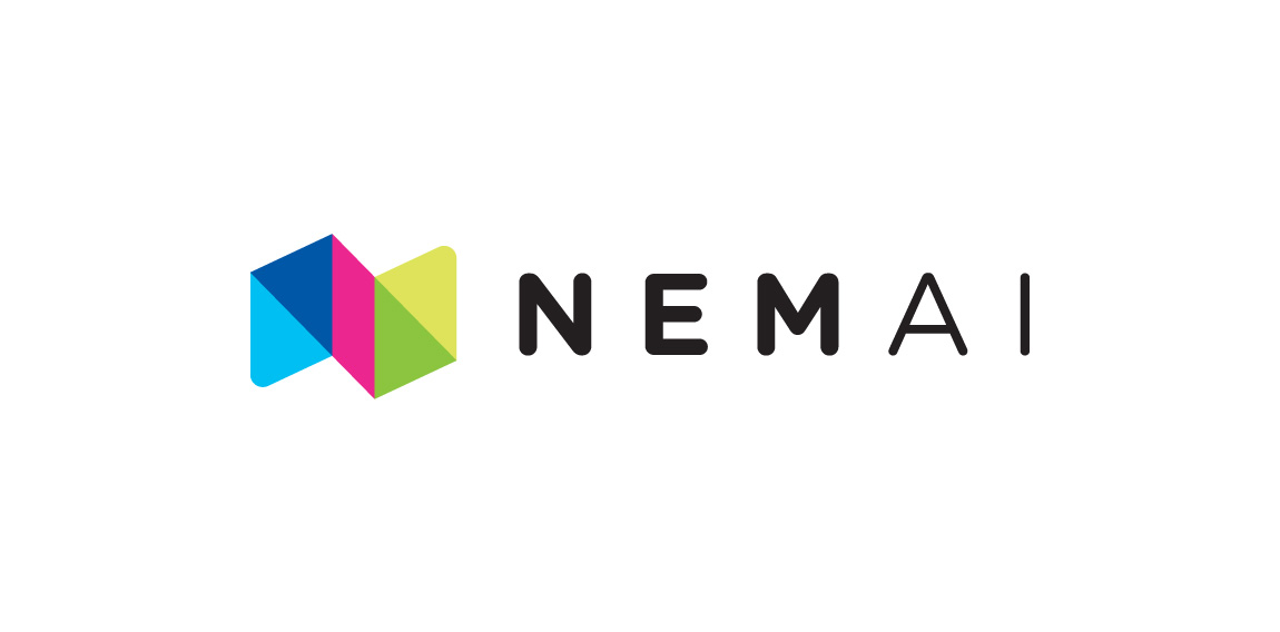
Brand Identity for Danish Ai&Machine learning startup NemAi (EasyAi). Logo is constructed as a monogram (n) and acronym (NAI)
The Beast - My personal brand
Dumma Branding is the design house of Duminda Perera. Duminda is currently involved in an ongoing logo project for design every day one Original, Clever, Wordmark/Verbicons or Negative logo.
Clinic
Made in a shape of flying human lie structure which shows freedom and global reach
Well the idea is pretty clear.

A branding concept for a medical clinic. The goal was to create a clean, playful logo to promote a stress-free and fun atmosphere. The stethoscope is a symbol known around the world as a tool used by doctors to listen to hearts and lungs. The heart shape represents love and care - something that is essential for any business whose purpose is to help those in need. And finally, the globally-recognized symbol for everlasting life - the heartbeat.
For the online store with a very diverse assortment of Logo included in the book logolounge 7
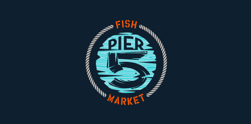
This logo is for a completely fictitious fish market.
The idea came to me when I discovered that it was possible to achieve a fish shape in the negative space within the bowl of the number 5. Dubbing my hypothetical company Pier 5 Fish Market, I created this illustrative mark in the hopes of really capturing the spirit of the nautical and maritime aesthetic. Type is custom for "Pier" and also the number 5, which is hand-rendered to look like it was painted on a wooden sign with a very wide, worn-out, thick-bristled brush. While it was important for the fish to show in negative space, it needed to look like a seemingly happenstance result of logical, real-world brush strokes. This is the minimal, alternate version of this logo.
Click here to see the case study for this logo, which chronicles its development, and includes full design rationale, sketches, electronic roughs, and alternate designs.
logobully
☆ HONORS ☆

-
shtef-sokolovich
190 logos
-
Boldflower Design Studio
189 logos
-
Ailton Marques
115 logos
-
Light Rainer
114 logos
-
Alek • Triptic.pl
107 logos
-
almosh82
96 logos
-
sadany
96 logos
-
Duminda Perera
93 logos
-
pizelato™
91 logos
-
Aleksandar
91 logos

Recent comments
حسین:
please send me...
chirag_j:
Hello is the above issue resolved?...
mrgraphics:
great logo...
Aleksandar:
Thank you Gile!...
fraGile:
Thanks a lot!...
Marko Bulatovic:
Great work!...
Popular tags
Our logo inspiration gallery will give you the creative boost you're looking for. Get your daily dose of logo design inspiration to work on your own logo design projects and get your business going. Be amazed by our logo designers and their brand guidelines. We are here to help you impress your clients and our fellow designers. Professionalize your logo design skills and get yourself to a new level. Browse our logo design gallery and discover all the new logo design trends and much more. We know you love logos!