Interested in this domain and website? Contact [email protected]

Entrepreneur Express
Entrepreneur Express


- Get unique ready made logos for $99.99
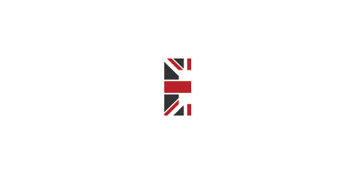
- Entrepreneur Express is an exclusive membership and mentoring programme for small business owners right here in the UK. Created by millionaire business owner and UK Entrepreneur, Phillip Reynolds.
- Submitted: 11/30/2012 • Featured: 01/05/2013
- Stats: This logo design has 5711 views and is 0 times added to someone's favorites. It has 5 votes with an average of 3.40 out of 5.
Designer
Comments: 3
Leave a Reply
Our logo inspiration gallery will give you the creative boost you're looking for. Get your daily dose of logo design inspiration to work on your own logo design projects and get your business going. Be amazed by our logo designers and their brand guidelines. We are here to help you impress your clients and our fellow designers. Professionalize your logo design skills and get yourself to a new level. Browse our logo design gallery and discover all the new logo design trends and much more. We know you love logos!
Perfect!
ReplyIt’s not perfect. The flag is upside down.
The one fundamental element of this logo and the designer didn’t even take the effort to check which way round the flag should be.
ReplyThanks for the feedback guys. Appreciated.
Reply