Interested in this domain and website? Contact [email protected]

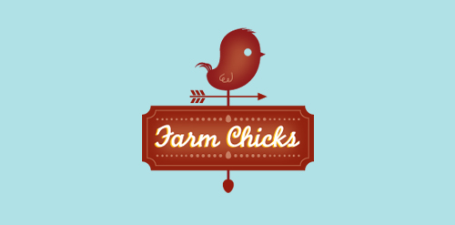
Farm Chicks
Farm Chicks


- Get unique ready made logos for $99.99
- fun, country gal style.
- Submitted: 03/15/2011 • Featured: 05/14/2011
- Stats: This logo design has 15320 views and is 0 times added to someone's favorites. It has 13 votes with an average of 4.00 out of 5.
Designer
Comments: 4
Leave a Reply


Our logo inspiration gallery will give you the creative boost you're looking for. Get your daily dose of logo design inspiration to work on your own logo design projects and get your business going. Be amazed by our logo designers and their brand guidelines. We are here to help you impress your clients and our fellow designers. Professionalize your logo design skills and get yourself to a new level. Browse our logo design gallery and discover all the new logo design trends and much more. We know you love logos!
love this
ReplyThanks, Colin
ReplyCool style, well put together. Is it my (failing) eyes or do the words “farm chicks” look blurry? Or is that the golden drop shadow?
ReplyIt is a gold drop shadow. (: your eyes are fine. Thanks for the comment.
Reply