Interested in this domain and website? Contact [email protected]

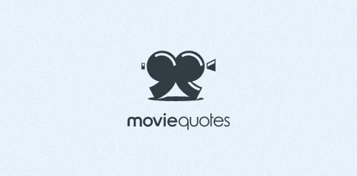
Movie Quotes
Movie Quotes


- Get unique ready made logos for $99.99
- I just couldn't think of anything more accurate to the theme like this.
- Submitted: 07/11/2011 • Featured: 07/21/2011
- Stats: This logo design has 15890 views and is 2 times added to someone's favorites. It has 27 votes with an average of 3.89 out of 5.
Designer
Comments: 10
Leave a Reply
Our logo inspiration gallery will give you the creative boost you're looking for. Get your daily dose of logo design inspiration to work on your own logo design projects and get your business going. Be amazed by our logo designers and their brand guidelines. We are here to help you impress your clients and our fellow designers. Professionalize your logo design skills and get yourself to a new level. Browse our logo design gallery and discover all the new logo design trends and much more. We know you love logos!
Lovely!
ReplyCool idea!
Replygreat!!
ReplyThank you all.
ReplyI’m really happy you all do like this one. :)
Very good indeed!
ReplyI like the style and typo fit perfect.
ReplyGreat concept!
ReplyCool Job!
Replygood idea
ReplyLovely!
Reply