Featured logos
Featured logos – Page 104
A mark for a sports supplement supplier called 'Stackz.' The concept was to create the letter 'S' from stacked elements.
Mark concept proposal for small family business Perga+. A company engaged in the bee bread "Perga" production and trade.
This is lovely fox logo design for "FOXO" and its construction. Icon simulates fox creating "O" – round, elegant & endless shape.
A logo created for a Japanese Restaurant called Tabe Tai (Want to Eat). The idea was to create a mark around the Japanese Torii while incorporating the restaurant's initials. Additionally, I designed the entire mark to reflect upon the ink strokes used in ancient Japanese paintings.
To create the logotype we just integrated the letter 'L' from Live and 'M' from mob, so as to generate the feel of livemob.
Mattathil Modular Kitchen. Branding Client Mattathil Modular Kitchen is one of the best and finest well designed modular kitchen made in Kerala. . Project goals Communicate the brand in an elegant and simple manner.
This is our own logo designed for initially for this company. Idea behind creating this logotype was just to make it visible ad readable in its simplicity. Since the name CRAZYDES evolved from CRAZY and DESIGNERS , we were keen in making it simple and easy for everyone to read upon. With this thought in our mind, we had created this logotype with the crazy Y letter in between the two words.
Logo design for the company "Bukdruk" dealing with short-run printing of books. Company wanted to create a symbol based on a book and a tree.
Logo for University Pharmacy. Letters A (for Apteka - means pharmacy in polish) and U (for University) creates an icon of a pill. The cross in upper right means medical connection of the icon but also express high quality of service by association with letter A. In result: A plus.
Logo for the company, which is engaged in service PC's, laptops, smartphones and other electronic devices.
The Potion Lady is a Melbourne based Australian Bush Flower Essence practitioner. The brand needed to be quirky, mystical and magical. The client wanted to create a character that would become the 'face' of the company so it had to have personality as well as portray the emotive nature of the business.
Artizan tea producer based in Canada. Client wanted vintage handcrafted style for start-up business.
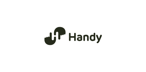
Logo proposal with a negative space showing "H" letter. Two hands together creates H letter. Find us on Instagram! http://instagram.com/tieatie_agency/ Check out other works portfolio: Branding Agency


