
Featured logos
Featured logos – Page 3
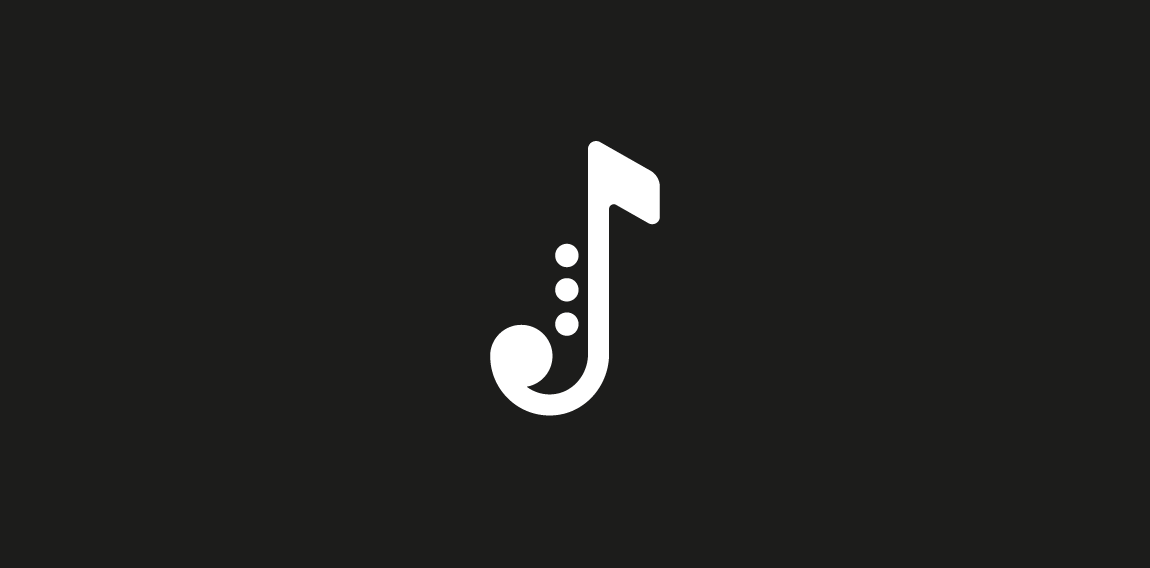
Single letter from marathon Logodays. J + note + saxophone = Jazz You also can buy it on shutterstock: https://www.shutterstock.com/ru/image-vector/jazz-music-logo-on-black-background-461586016?rid=3611111 More info about fast logos like this one here: https://fankin-a.myportfolio.com/logodays


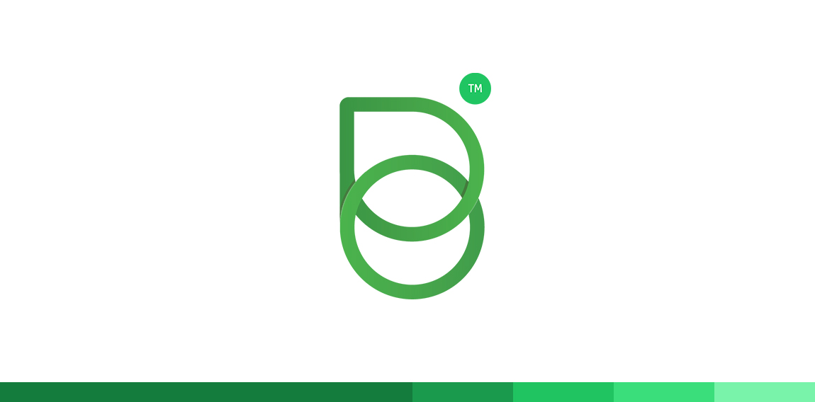
B + O
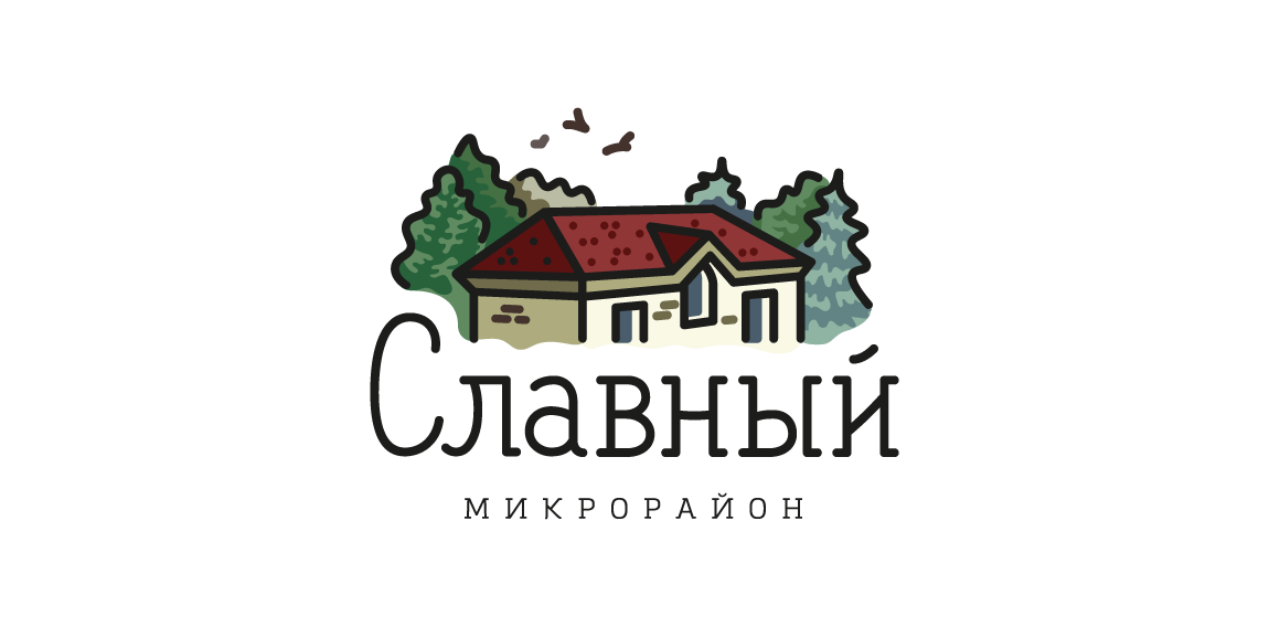
Townhouse neighborhood in Kirov area, Russia. Full presentation: https://www.behance.net/gallery/42848125/Logo-of-the-Slavniyneighborhood
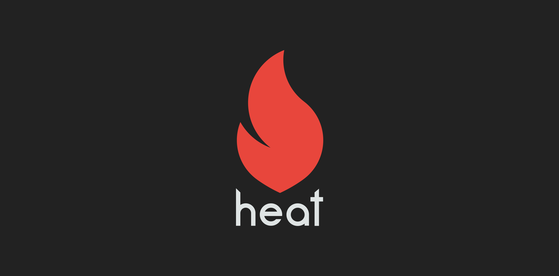
Updated version of the heat logo.

Digital marketing company

Logo design for polish Mom blogger.
Minimalist and geometric logo of a buffalo.
Play + H + House
Eagles look (hair salon)- logo.
F Alphabet
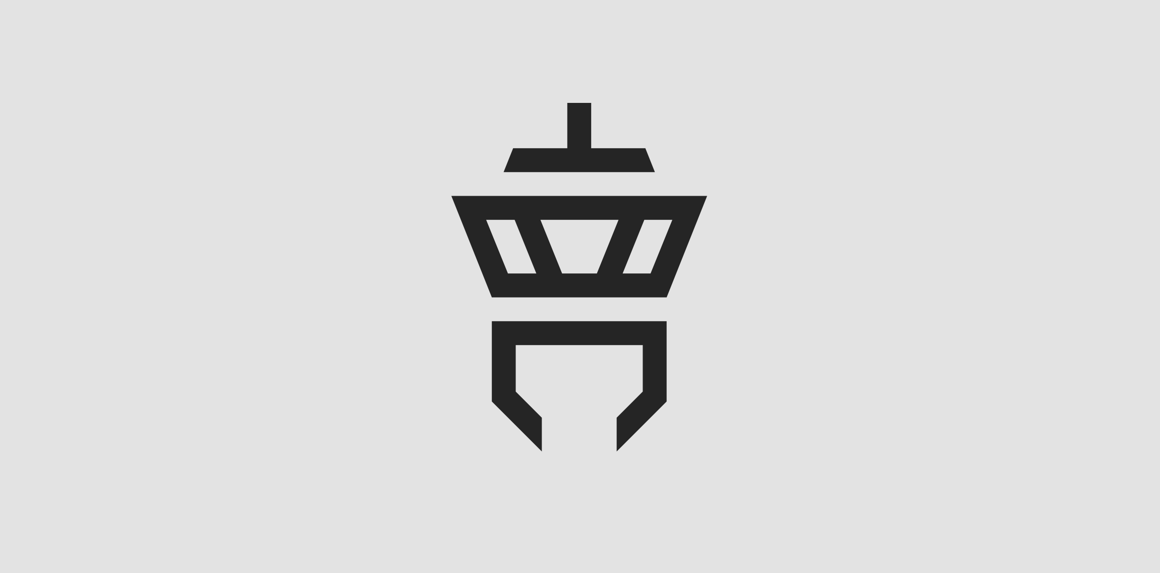
Client: Tower Communication The customer‘s wish was to have an abstract depiction of an airport tower in the logo. The antenna of the tower is an upside down T (for “Tower“) and the lower area is a downwardly open C (for “Communication“).
Dove
Sfera by Boldflower Design Studio Contact me: meksikositi@gmail.com
Fine Line Accounting Logo Typographic logo design
It contains two letters G in one symbol.
X + Butterfly
Turbo logo

A + Alpha
(Map) Pin + Bird
S + Pot + Bowl
A monogram for a prsonal trainer
Shine Logo
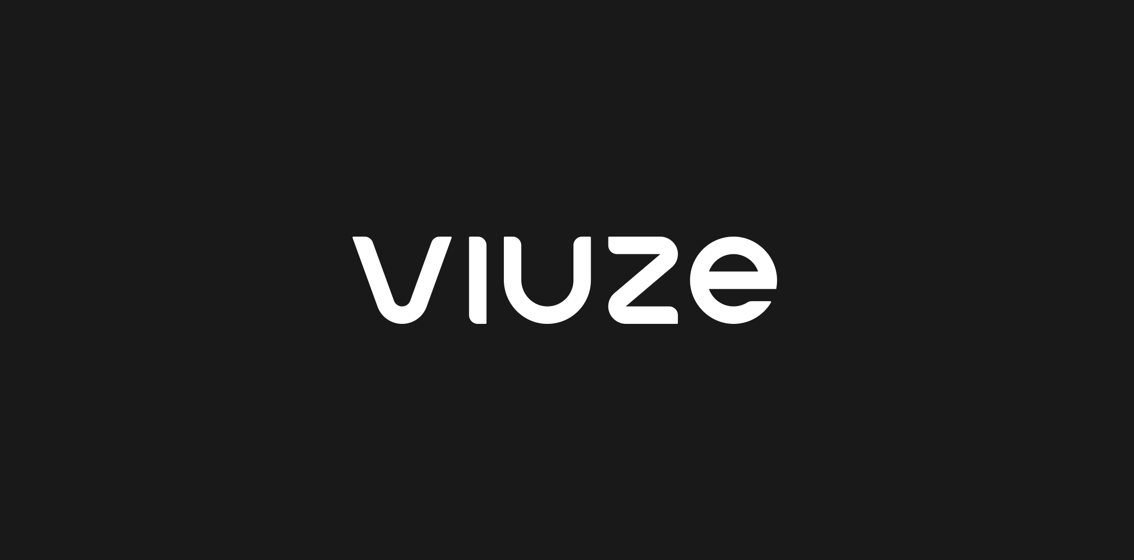
My personal logo. The name “viuze“ means “vivid colour light“ and is a composition of the english word “vivid“, the spanish word “luz“ (=light) and the german word “Farbe“ (=colour).
Logo design for an approved building inspector PRO Building Control.
We created a symbol based on an abstract building. A prominent square showing a fire escape route, in the form of a tick, was laid on top of an outlined square representing the solid foundations PRO work from.