Pier 5 Fish Market – minimal
Pier 5 Fish Market – minimal

- This logo is for a completely fictitious fish market.
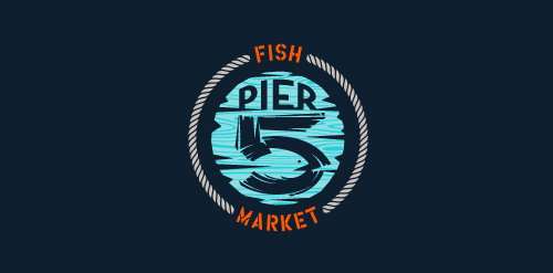
The idea came to me when I discovered that it was possible to achieve a fish shape in the negative space within the bowl of the number 5. Dubbing my hypothetical company Pier 5 Fish Market, I created this illustrative mark in the hopes of really capturing the spirit of the nautical and maritime aesthetic. Type is custom for "Pier" and also the number 5, which is hand-rendered to look like it was painted on a wooden sign with a very wide, worn-out, thick-bristled brush. While it was important for the fish to show in negative space, it needed to look like a seemingly happenstance result of logical, real-world brush strokes. This is the minimal, alternate version of this logo.
Click here to see the case study for this logo, which chronicles its development, and includes full design rationale, sketches, electronic roughs, and alternate designs. Designer: atomicvibe
 - Submitted: 08/22/2011 • Featured: 07/04/2013
- Stats: This logo design has 17555 views and is 0 times added to someone's favorites. It has 7 votes with an average of 3.43 out of 5.
Designer
atomicvibe
More logo design
Camerton (tuning fork) - the sound standard (Russian word "камертон").
"Wine's Camerton" – the standard of the best wine.
Logo for wine shop (noble wines)..


