Interested in this domain and website? Contact [email protected]

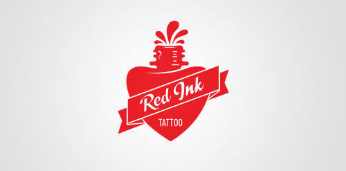
Red Ink Tattoo
Red Ink Tattoo


- Get unique ready made logos for $99.99
- Logo design for Red Ink Tattoo Studio.
- Submitted: 04/22/2011 • Featured: 05/01/2011
- Stats: This logo design has 15988 views and is 0 times added to someone's favorites. It has 8 votes with an average of 4.00 out of 5.
Designer
Comments: 4
Leave a Reply


Our logo inspiration gallery will give you the creative boost you're looking for. Get your daily dose of logo design inspiration to work on your own logo design projects and get your business going. Be amazed by our logo designers and their brand guidelines. We are here to help you impress your clients and our fellow designers. Professionalize your logo design skills and get yourself to a new level. Browse our logo design gallery and discover all the new logo design trends and much more. We know you love logos!
we used the same bottle of ink I guess…
but I’ve done it first :)
http://www.logomoose.com/logo-design/inkheart/
ReplyThis is the problem of use image bank.
Replyhttp://t1.ftcdn.net/jpg/00/14/21/12/400_F_14211299_dDU1sCCizVuiMSfC2eHDPTLfdLltCchf.jpg
Let’s hope your clients don’t find out huh. This is exactly why you should never use any stock images in your logos (I don’t even think it’s allowed.. at least with getty images).
ReplyHaha, most amusing this is.
Why not emphasize the ‘ink’ which would make a far more interesting bottle.
Reply