Interested in this domain and website? Contact [email protected]

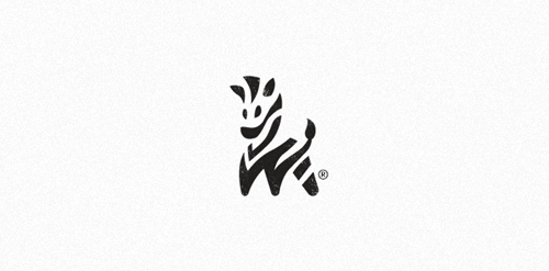
Zebra
Zebra


- Get unique ready made logos for $99.99
- Zebra Brandmark ©
- Submitted: 08/19/2014 • Featured: 09/10/2014
 September 2014
- Stats: This logo design has 23441 views and is 28 times added to someone's favorites. It has 151 votes with an average of 4.18 out of 5.
Designer
Comments: 11
Leave a Reply

Our logo inspiration gallery will give you the creative boost you're looking for. Get your daily dose of logo design inspiration to work on your own logo design projects and get your business going. Be amazed by our logo designers and their brand guidelines. We are here to help you impress your clients and our fellow designers. Professionalize your logo design skills and get yourself to a new level. Browse our logo design gallery and discover all the new logo design trends and much more. We know you love logos!
Congrats! Beautiful work.
ReplyThank you @shtef-sokolovich!
ReplyBadass!!!
ReplyHey – thanks for support @scriptdemolition !
ReplyLogo of the year 2014!
ReplyI absolutely love this. Great job!
ReplyThanks!
ReplyThis is really awesome! Nice job!
ReplyThanks a lot Tom!
ReplyNice logo!
ReplyAmazing Logo
Reply