Highest rated logos
Highest rated logos – Page 186
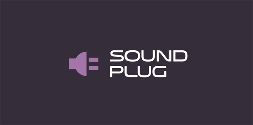
Logo for music store, representing speaker icon and plugg.


4hands is a design studio based in Belo Horizonte, MG, Brazil, specialized in manufacturing high-end cajons.
New general logo for an online Expert Witness Directory, incorporating a themed pictogram. A very challenging project, but immensely pleased with the result, as is the client, which always helps. Finding that 'apparently simple' solution proved painstaking, but when I look at the icon now, it looks so easy. Just create the Good Book/and or reference Directory out of the shape of a D, and place the left hand (giving oath etc) on it. Ta daaaa… Anything but ta daaaa tho. Fonts used for Witness Directory: Kefa II Pro Bold and tag-line: Zona Pro Italic, both purchased from Myfonts.

A personal logo. I was trying to find different ways to combine the two letters J and U together and after many sketches and versions, this one stuck. Open to comments and critiques!
Delcycer new website for recycle goods in sale

Logo for the website design and development company


provides services in management and business development

wireless love icon
The logo of "Comitato Feste" represents fully represent us, is Italian, vintage but with a very modern graphics. We really love illustrated logos and in this case we were able to put in everything that we like. We were looking for a symbol that immediately bring to mind the Italian family, and then we thought about the clothes of the grandmother hanging on the washing line. The image was made by one of our photography in a very picturesque area of our city. We are very proud of this logo!
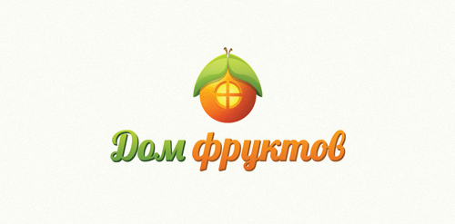
The shop of fruit and vegetables with home delivery. http://www.domfruktov.ru

Logotype for Theme.Works. Website to design your Wordpress theme.
Squirlo Logo concepts

Logo design for Student Centraal, a Dutch community for students.


This is our logo, for our agency. It´s made of hair, because we have a lot of hair in our head and we decided to use it for something useful. Thank you for looking!