Highest rated logos
Highest rated logos – Page 219

I was approached by new organisation 'Monitor Healthcare' to design their logo and brand identity.
Monitor Healthcare aim to provide people all around Africa with free medical advice via online and telephone methods. As this service is to be for the full continent I wanted to create a logo that would represent this unity.
The different colours of each section of the cross are representative of the North, East, South and West regions of Africa. The individual colours were picked based on the flags of the countries within each region.
The white cross in the middle of the logo is to symbalise the unity of the continent which Monitor Healthcare aim to provide.


Custom lettering logo for LA Bikini.
Software and Servers
DM
La marca fué diseñada para un proyecto de Academia de Baile. Actualmente no está en uso pero se encuentra registrada para algún futuro emprendedor.

This is one of four log concepts that i designed and developed for a client. Their business is brand protection so the concepts had to be crystal. This logo didn't get picked as its visual associations did not relate to the corporate values of the client. I may recycle it as a personal brand id but still the visual elements has no relation to the name of my business "atoms". Thanks

Mobile Convert is a young team specializing in creation of audio and video content distribution systems on the Internet, develop technical content, mobile applications, games, websites and content management systems. - - - - Logotype has a simple, readable form resulting from the simplification of the M letter and incorporated in it a universal symbol of "Play" clearly referring to the audio-visual character of the company. - - - Live on www.mobileconvert.pl - - Full ID here http://on.be.net/1HbaOBD - Follow us on www.fb.me/triptic.design

jff
Logo for brand "2meters" (Rus: "2МЕТРА") of Russian building company "Building technology and complectation".

Logo/label for Black Twig farms. The farm is in TN and the most popular apple in TN is named Black Twig and make a cider from them. This variety of apple has a strong history in TN as it was widely known as Andrew Jackson's favorite apple, so president Jackson is portrayed on the logo/label.
Proposal for personal protege/mentoring and accountability system.
www.mikemark.com Logo for a students' conference

Logo - part of visual identification for kids accessories brand

Recreation on a open space - company logo. Especially by nordic walking, bocking and skiking.

http://wp.me/p4571j-v2

logo for a construction services company based in the united states.
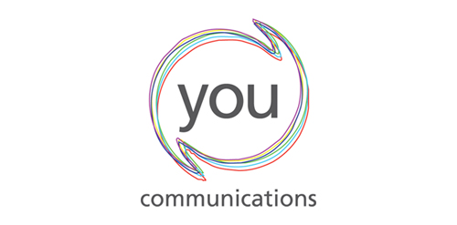
Circular shape with speechmarks reaching out show the communications specialism. The coloured lines show the diversity of their clients and the offer. The lack of symmetry of the lines adds energy - the feeling of communication lines buzzing. Logo represents

Designed for Pedro Rocha, Academic of Law in Brazil in 2012

a building company

Logo for a gay friendly holiday resort. The logomark shows fig leaf (naturism) with a palm tree (tropical) in the negative space. The logomark is also playfully phallic in nature which the owners where very receptive of.

Logo for energy drink.

Combination of a battery and a suitcase.
ryde font. Laevsky Design

Logo for IT company.