Highest rated logos
Highest rated logos – Page 224

Logo/label for Black Twig farms. The farm is in TN and the most popular apple in TN is named Black Twig and make a cider from them. This variety of apple has a strong history in TN as it was widely known as Andrew Jackson's favorite apple, so president Jackson is portrayed on the logo/label.


Conceptual design showing a bird's nest with an egg in the negative space. For sale.

Logo for company which offers technical and geological services in the mining sector. The mark is inspired from from the shape of the 'prospector hammer".The varied colors /sections symbolize the numerous data and information that the company collects and presents in a compact form to its clients .The colors and section also communicate the idea that the company is adept at exploring varied terrains and areas

ZipLadder concept logo

SUNDAY MARKET - it's very atmospheric project. Every Sunday in Omsk, the club Atma-Sphere held SUNDAY MARKET, where a warm and friendly atmosphere you'll find a unique jewelry and clothing, choose a toy or a beautiful handmade notebook, can meet a truly original gift for a friend or for Mom. Live music, free workshops and presentations, as well as free tea and delicious homemade sweets.
www.mikemark.com Logo for a students' conference
Logo made just for fun :)
To create the Saniport’s logo, the element of inspiration was the water. The logo is thus made up of two droplets whose colors represent the duality / balance of hot and cold. When water vapor meets a cold surface (as in a toilet when bathing, for example), some small water droplets appear, represented by the logo particles.

Logo for a female Dj from LA, US
Sweet Siren is company that sells handmade soap and body pearls for women.

Winter village.
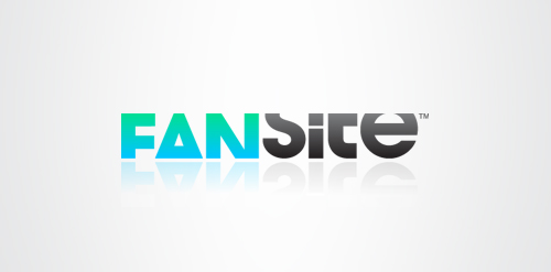
Fansite is a modern, digital equivalent of a fan scrapbook or fanzine; a social network for fans to get together, discuss and swap content based on their favourite celebrity. The typeface selected is modern and has a strong relevant personality itself, but it is treated in a unique way. Each letter is tightly cropped, yet still legible, inspired from old fanzines when fans would use scissors to cut and layout their magazines. This modern, digital equivalent creates a unique and memorable logotype.
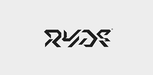
ryde font. Laevsky Design

Recreation on a open space - company logo. Especially by nordic walking, bocking and skiking.
Logo design for a tree surgeon.

Logo for night club

Pascana Hotel is located in different parts of Perú. The name comes from a word of the native and official Peruvian language called Quechua, which literally means “A stopover in a trip”. For Pascana Hotel the concept was to represent the peruvian culture at its best. The colors used are a characteristic of peruvian textiles. In this case they give a warm feeling to the Hotel. And the forms used are part of another characteristic of Peruvian culture, that is the use of lines and forms. This one tries to represent a place to stay. Like a native house.
Logo proposal for rural hostel in an area of vineyards and whose decoration is oriented to the world of wine.


FREYA is fresh modern dynamic brand with short easy memorable name. It will suite well to any business or industry.

Everything for aquarian.

Octoplus logo