Highest rated logos
Highest rated logos – Page 318


Logo design for an electrical and hardware shop called Focal Point
MAIN

Logo ideal for a security company or something similar.
Original logo for printing or writing. For sale.

Gallotti Umbrellas, italian umbrella company corporate identity and logo design

Metal sheet factory from Romania.

DK

Logo concept for new business.
TV, sound and print production firm

Euroviet EX is a company that provides interior furniture in Da Nang, Vietnam.
Logo for my art & design studio.
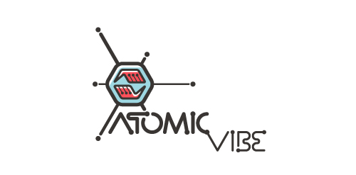
I define ATOMICvibe as the "a-HA!" moment of clarity in the creative process. Like nuclear fusion, it's when tiny ideas coalesce, and then explode into beautiful design.
The logo visually depicts this creative reaction. Forming abstract A & V shapes, the converging hands cradle the tiny beginnings of a big idea, fusing them until they discharge a shockwave of creativity. The custom type, designed to perfectly integrate with the mark, is meant to symbolize electron paths. Heavily inspired by retro imagery from the Atomic Age: science, the Space Race, Sputnik, the iconic George Nelson Ball Clock.
Click here to see the case study for this logo, which chronicles its development, and includes full design rationale, sketches, electronic roughs, and alternate designs.

Alessandra Modiano is brand of clothes and accessories. The client wanted a logo in Masonic stylistic. http://logomachine.net/

Second version logo made for an Q&A website dedicated to women.

A sign promoting a free Organic Food icon set – https://www.behance.net/gallery/24471401/Organic-Food-Free-Icon-Set

Logo design for power grid company.
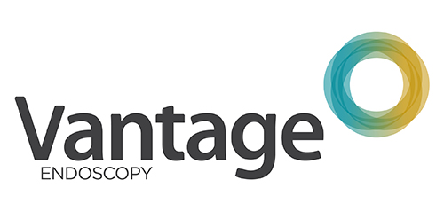
Inspired by the Spirograph, Urban Jungle designed the identity using a combination of four semi-transparent aqua and ochre circles. The circles symbolize the convergence of two unique corporate entities into one new corporate brand identity — Vantage. Using charcoal for the typeface, the identity blends a vibrant colour palette giving it a fresh, smart and energetic feel, and reflects the youthful and contemporary edge of the company.
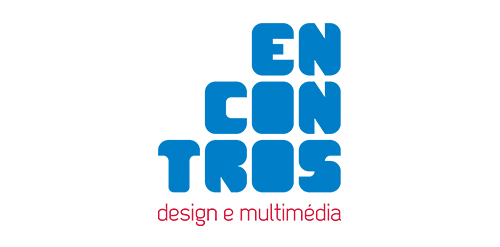
[see more in behance @ http://bit.ly/W8GJLS] Encontros Design e Multimédia is an event. It has being taken place since 2009 and consists in a week dedicated to promote and develop design and multimedia activities, workshops and meetings in the city of Braga. It's promoted by Escola Profissional de Braga. The design, organisation and communication of the event is the responsibility of a finalist student. [The brief] Encontros Design e Multimédia had a clear ambition, grow year after year, it wanted to inspire, involve and thrill the students, professionals and enthusiasts about Design and Multimedia. The logo was to be used in the website, facebook, promotional material, including posters, flyers, video, and a lot more. The goal couldn't be clearer, it had to be unusual. [The solution] The logo represents Encontros's strong ambition. It has all the elements to succeed, it's simple, relevant, it incorporates tradition, it's distinct, memorable, versatile and it stands out from the crowd. It's designed to be filled. Filled with photos, images, participants, speakers, filled with design and multimedia. It has no icons of design or multimedia and doesn't need them, it has all the qualities of both and all the creativity to be anything. [Typography] Encontros has a unique typeface, its custom and it's designed specifically for this brand. It's a bold geometric typeface designed to be filled and to get noticed in every contexts. [Colors] The colors are one of the most important elements of Encontros. The chromatic scheme is very expressive, it's a variation of the well known CMYK, providing a vast number of combinations making the brand very dynamic and inspiring as well. [see more in behance @ http://bit.ly/W8GJLS] [joserodrigues @ http://be.net/joserodrigues]
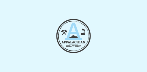
A concept made for a investment fund in the appalachian region - strong mark showing the past and the future of the region - coal mines, factories, business ect.

http://wp.me/s4571j-altegro

ethnic cafe