Highest rated logos
Highest rated logos – Page 334
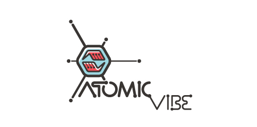
Logo for my art & design studio.
I define ATOMICvibe as the "a-HA!" moment of clarity in the creative process. Like nuclear fusion, it's when tiny ideas coalesce, and then explode into beautiful design.
The logo visually depicts this creative reaction. Forming abstract A & V shapes, the converging hands cradle the tiny beginnings of a big idea, fusing them until they discharge a shockwave of creativity. The custom type, designed to perfectly integrate with the mark, is meant to symbolize electron paths. Heavily inspired by retro imagery from the Atomic Age: science, the Space Race, Sputnik, the iconic George Nelson Ball Clock.
Click here to see the case study for this logo, which chronicles its development, and includes full design rationale, sketches, electronic roughs, and alternate designs.


Spa and wellness. Body and soul.

Sports marketing that specializes in highlight videos of students playing their sport. These videos are to be sent to recruiting coaches for colleges and sports teams.
Logo for a coffee shop
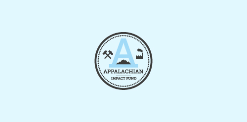
A concept made for a investment fund in the appalachian region - strong mark showing the past and the future of the region - coal mines, factories, business ect.

Unique dog character logo design featuring a fun and bold little chihuahua dog all dressed up in a formal tuxedo, bowler hat and a bow tie. https://www.logomood.com/downloads/canine-closet/

ethnic cafe

Espeero Distribution Company for computer hardware in Iran. www.espeero.com

The logo was designed for a Online Flower Shop. They will send flowers to your loved one directly to her/his house when you order online. This logo tries to reflect the freshness of the flowers and the products that "Kukyflor" offers. The typography of the logo was redesign to give the sensation of petals forming the word "kukyflor".


Custom typo for Old Regional Pub


Logo for an event management company that organises commercial parties. Logo has been approved by the client.

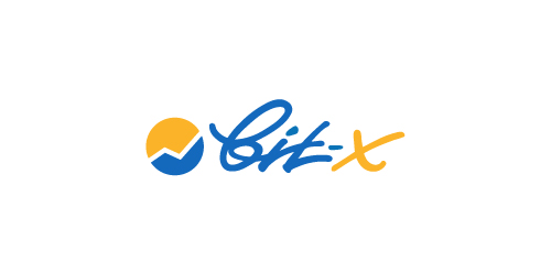
Logo for online exchange, crypto-currencies trading and bitcoins mining.

Abstract conceptual logo showing the two hemispheres of the brain and a gear shift.
Professional printer

Logo for a smartchip which protect brain from negative waves from phones.

Bepax is a newcomer in airline companies representation and aviation consulting, based in Paris. Brand Brothers designed their visual identity, based on an original typography, and produced a print and web branding that gives Bepax an image in contrast to its competitors.

Logo for jewelry manufacturers.
Logo for a contest

HOTOX is fresh modern dynamic brand with short easy memorable name. It will suite well to any business or industry.
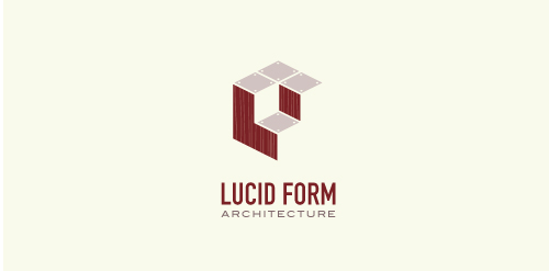
This logo is for a completely fictitious architecture studio called Lucid Form Architecture.
The icon is based on an optical illusion of a cube within a cube. Primarily, the form depicts a big cube, made of wood walls and metal-plated top surfaces, with a notch cut out of the center, resulting in a 3-D "L" shape. However, the longer one looks at this, perception begins to shift, resulting in a couple of different interpretations: 1) a small cube with a wooden wall and metal-plated bottom, in the corner of a room, hovering near the top of a tiled ceiling; 2) a room, tilted 90° clockwise, with hardwood floors, tiled walls, and a cube with a wood countertop and metal-plated side on the floor in the corner. This perception shift is important to the name, because it presents an ironic twist. To make "lucid" means to make clear, and while the icon seems to initially baffle and confuse, it ultimately encourages the viewer to challenge his or her preconceived notions of "perception." So too is the Lucid Form methodology for creating seeming impossible structures.