Highest rated logos
Highest rated logos – Page 336

Uprow


Sign for sale

FMCG Company

Logo for pet store specializing in the sale of fish


lighting equipment

Logo for new watch brand. Dangeruss is a play on the owners name - Russ.

Developed for a paper company.
Logo is based on spelling idea of the word EDEL, which you read in the right way EDL, that's why the letter are written in the box and double "e" is written in two lines. In this constalation you read it EDL. EDEL is logo for luxury furniture manufacturer.

Work for a company specializing in security guarding services. It's both a security camera and an observing eye.
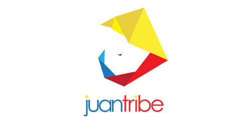
Logo for Juan Tribe - inspired by origami / paper folds - the logo makes use of the Philippine colors - the logo resembles "Juan Tamad" who is a character in a famous Philippine folklore noteworthy for extreme laziness.

Alternative logotype version for Almaty metro.

The baker wanted a naughty edgy logo. Wats more 'fun' that a chocolate kisses lips and cherry...
Logo designed for a high end clothing store for kids.
Logo for Jeff Foxworthy's outdoor personality brand.

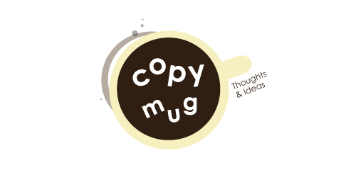
Logo for the brand of premium coffee and tea

unused logo proposal for flash film media
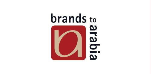
Company who brough occidental known brands to Arab world.

This is another logo for the portfolio. It is a pity that only for a portfolio ...

Pendo started as a webdevelopment company trying to be of big value to its customers. Pendo is Latin for 'value', the meaing behind the name is that the idea of the client together with our solution creates a better/stronger result (more valueable).
Because we started as webdevelopment company the logo exists of two brackets < and >, these two combined create a stronger (more valueable) link.
The color is not final yet, I'm thinking of using a slightly darker and more blueish color in the final version.
Logo design for photographer.

Need help with organizing your life? Your office? They specialize in getting you "put together!"