Highest rated logos
Highest rated logos – Page 343

Fireworks company


Q3 Marine Training Solutions
Logo for a small scooter and motorcycle shop.
sea food logo

A concept made for a contest. A new brand of flakes. Taste which takes you to the stars ;)
Fashion Design
Balkan Hard - Techno Community

"Brand with typography designed for a law firm that works with realistic idea but to show the seriousness neoclassical added serifs to her.”
bird


IT company

A brand new company providing training and support to organizations that care for the elderly and developmentally disabled adults.


Project created for a company which works in the sphere of warehousing ISO- containers. http://logomachine.net/

second concept for muh!caffe | GERMANY | 2012
Campers for a cause
Building Engineering

Logo design for a law firm company.
The Anagenix corporate identity was inspired by phyllotaxis which is an arrangement of crisscrossing spirals found in nature. The visual of this concept and everything Anagenix stands for has an interesting parallel of how they combine science with nature through innovation and discovery. The circles contained in the shape symbolise their brand values – the many partnerships, the scientific discipline, their expertise and trustworthiness. The colour palette was inspired by its NZ origins and nature. Looking at the world through this scientific lens of the phyllotaxis this identity has been designed to behave like a chameleon by taking on the form of the medium it is put on. It may applied with varying images from the NZ landscape and the natural products that may be in the pipeline. It may also be diecut to suggest the explorative nature of their business.

Logo for racing team

naming and logo created for a trading company based in mexico.
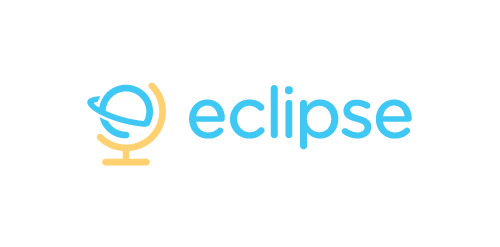
Eclipse offer specialist training software - mostly linguistic, but also teachings on grammar, syntax, etc. The use of the globe device reinforces the idea that language & communication is a ‘global’ exercise. Conceptually the design is of course inspired by a globe on its axis/stand. Since the idea of the eclipse is not necessary representative of solar or lunar, the mark focuses on how eclipses are created, orbit – The precise moment the Earth/Moon orbit is in relation to the Sun. The planet also forming an abstract E, creating a subtle monogram.
Logo Design for a high-end residential contractor based in Colorado.