
Highest rated logos
Highest rated logos – Page 7
B1 Media- ''negative space'' logo.


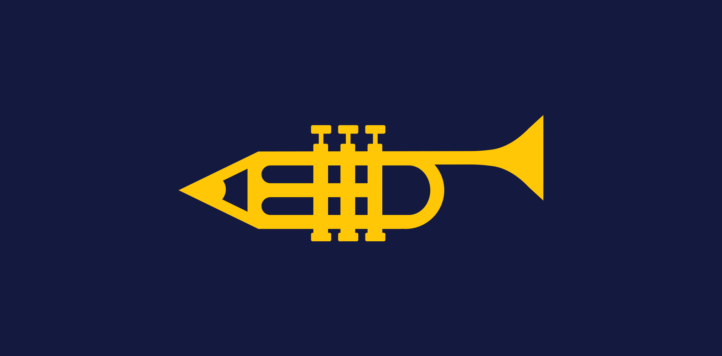
Logo for a company that sells sheet music for brass combos in the Netherlands. So if you and some friends play trumpet, trombone or saxophone, and want to play with a band, you can find sheet music for the most popular music here. The owner of the website is a trumpet player that actually writes the arrangements.
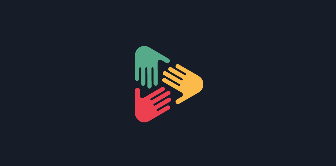
Logo proposal for a digital media that working together with talented creators to write articles, produce videos and publish the content to the public.
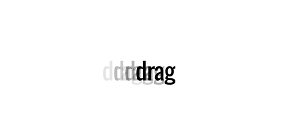
I decided to challenge myself to create logotypes everyday with random words.
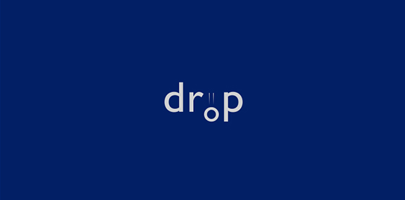
I decided to challenge myself to create logotypes everyday with random words.
Logotipo para loja de roupas infantis
Simple bird unused logo.
X + Butterfly
The 'cineflor' is made up of two words, 'cine' (root - kineo is an ancient Greek word, meaning 'to move' or 'stir up') and 'flor' ( root - latin word for the flower), e.g. energy healing, massage therapy, different types of creativity,etc.
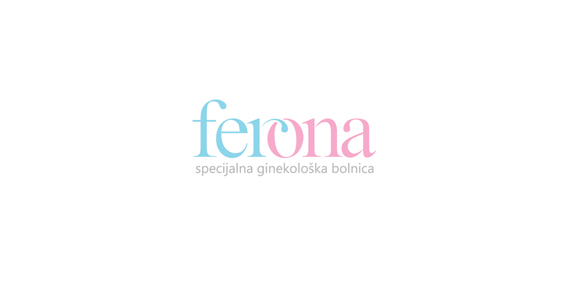
"Ferona" (fertility clinic)- logo. Idea: part of a letter "r" represents a spermatozoon wich enters the letter "o" that represents an ovum.
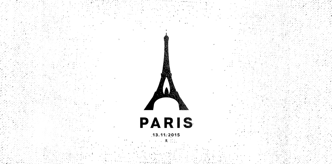
Paris 13. 11. 2015
Landscaping & Gardening
Exclusive DECOrations' producer.
Owl logo just for fun. www.ashflint.com
great logo for the children and clean energy! SUNLAB can be understood as the laboratory of the sun, which symbolizes light and hope in life and can also be used for charitable purposes and business non-profit organization that helps children in need of care
Falcon Eye Solutions provides cloud based surveillance cameras and systems
The city of Torcy, France recently built a great complex dedicated to the promotion of Culture & Arts, highlighting local and national artists. I was contacted to work on its complete Brand Identity, including Naming, Logotype, visual identity, Print communication, exterior & interior signage, website design and clothing.
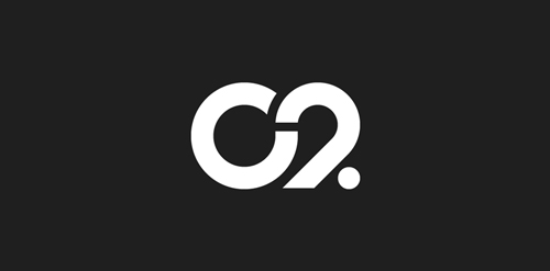
The main goal was to create a total new and innovative identity. Naming took a great part in that sense. I focused on trying to create a simple yet effective name for that building. C2 was chosen from a couple of hundred names for its international recognition, pronunciation and readibility. It stands simply for Cultural Center or the two initials 2xC -> C2.
As far as the logo is concerned, it followed in a logical way the naming process. A will to create a modern and contemporary logotype, yet efficient, minimal, powerful and durable. It was created so it could nicely fit and be readable at a great or tiny size on any document. The logotype guidelines show a slight dipping of the « C » and the « . » to create the optical illusion that all characters are aligned on the same baseline.
Logo for Wedding Salon
Blend of elephant (big) and door label (hanger). For sale.
ALFIO is fresh modern dynamic brand with short easy memorable name. It will suite well to any business or industry.
Design Bomb (Graphic Design Studio)
http://dribbble.com/shots/1485572-Design-Bomb
Logotype for DJ/Producer Binzo
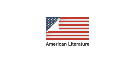
A simple idea using a page curl to reveal the American flag.
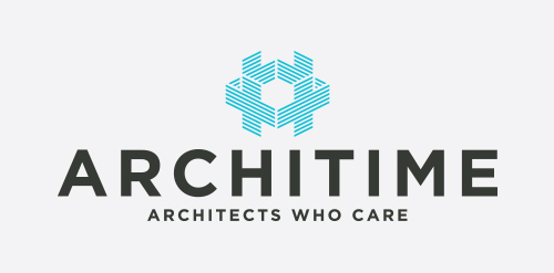
Made this logo for health minded architects