
Highest rated logos
Most rated logos – Page 342
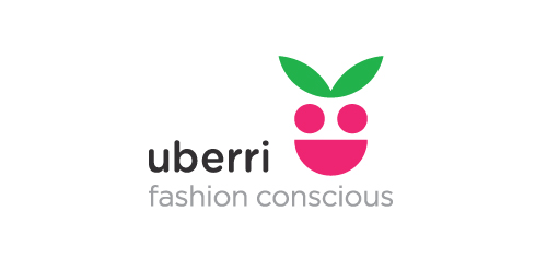
In development for Uberri, a new children's clothing label based in Australia. Target market is 5-12yr old girls, largest output is summer, beach wear & related accessories. The name Uberri, integrates with the tagline; Uberri (You are very) fashion concious, it also compares fruit to children - always growing, bright, full of life, etc.


Ship nhanh is mean fast shipping. Small business locate in Viet Nam

Logo for a home decor business. The mark represent's the companies initials CQ and the sun, sea and scenery of the Caribbean.
Simple idea
Some working concepts for my studio logo redesign.
Egg farming business.
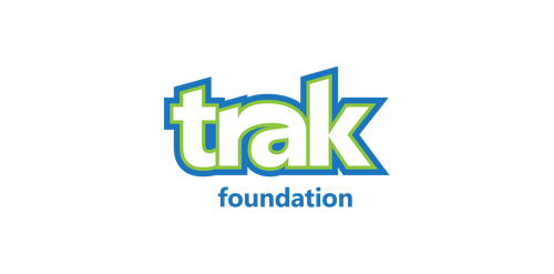
TRAK Foundation is a non profit organization comprised of members who raise money for children's charities through athletic and social events.
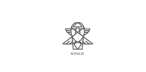
ROYALIX is fresh modern dynamic brand with short easy memorable name. It will suite well to any business or industry.
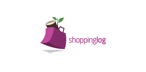
shopping bag + wood log
A unique logo for your unique brand.

WILFREDON is fresh modern dynamic brand with short easy memorable name. It will suite well to any business or industry
competitive work
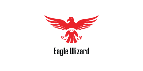
Two symbols, merged within one: an eagle and a wizard
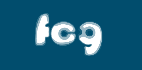
Fórum Cultural de Gulpilhares (FCG) A space dedicated to culture but mainly to music teaching. The logo was inspired by the propagation of the sound, the famous Font Bauhaus and no less famous music group.
Web design company based in Dublin, Ireland.
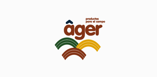
naming and logo created for an agricultural products company based in mexico.
logo created for a hair straightener product.
Lcafe
VS Monogram
[see more in behance @ http://bit.ly/W8GJLS] Encontros Design e Multimédia is an event. It has being taken place since 2009 and consists in a week dedicated to promote and develop design and multimedia activities, workshops and meetings in the city of Braga. It's promoted by Escola Profissional de Braga. The design, organisation and communication of the event is the responsibility of a finalist student. [The brief] Encontros Design e Multimédia had a clear ambition, grow year after year, it wanted to inspire, involve and thrill the students, professionals and enthusiasts about Design and Multimedia. The logo was to be used in the website, facebook, promotional material, including posters, flyers, video, and a lot more. The goal couldn't be clearer, it had to be unusual. [The solution] The logo represents Encontros's strong ambition. It has all the elements to succeed, it's simple, relevant, it incorporates tradition, it's distinct, memorable, versatile and it stands out from the crowd. It's designed to be filled. Filled with photos, images, participants, speakers, filled with design and multimedia. It has no icons of design or multimedia and doesn't need them, it has all the qualities of both and all the creativity to be anything. [Typography] Encontros has a unique typeface, its custom and it's designed specifically for this brand. It's a bold geometric typeface designed to be filled and to get noticed in every contexts. [Colors] The colors are one of the most important elements of Encontros. The chromatic scheme is very expressive, it's a variation of the well known CMYK, providing a vast number of combinations making the brand very dynamic and inspiring as well. [see more in behance @ http://bit.ly/W8GJLS] [joserodrigues @ http://be.net/joserodrigues]
Recently designed logo for an young french movie director Gary Sfez.
:)
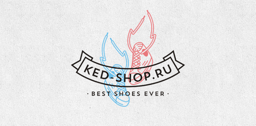
Branding for online sneakers store. Greetings from Siberia.
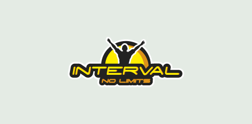
Logo for company organizing sports events. Mainly engaged in the organization of running, triathlons, crosses and trails races.
Our logo inspiration gallery will give you the creative boost you're looking for. Get your daily dose of logo design inspiration to work on your own logo design projects and get your business going. Be amazed by our logo designers and their brand guidelines. We are here to help you impress your clients and our fellow designers. Professionalize your logo design skills and get yourself to a new level. Browse our logo design gallery and discover all the new logo design trends and much more. We know you love logos!