
Highest rated logos
Most rated logos – Page 348
Last concept for Store More, a company offering cloud hosting, reseller, domain and ftp storage space services.


Logo for a local software and app development company.
investment & development
Typography
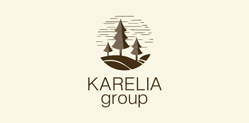
KARELIA group is the importer of wood from Russia
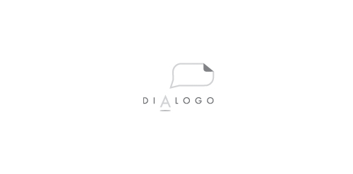
BRAND LOGO DESIGN FOR A POLITIC DESIGN STUDIO Concept: the letter "A" with the text cloud refers to the simple & clean way that is needed to talk with another person. Color: we don´t identify with any color or any political party, that´s why we prefer t use the gray; that makes reference to the inteligence and also is an ellegant and sober color
...
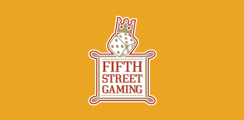
Logo made for a casino management company.
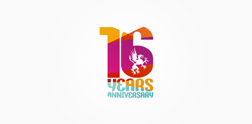
16 years anniversary of Studio Martin club.
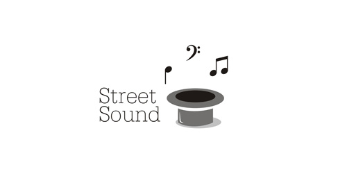
Logo for music store.
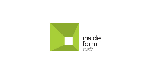
inside form | interior design
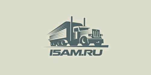
The equipment for automobile transportations.
Football team logo
Trade cinema company
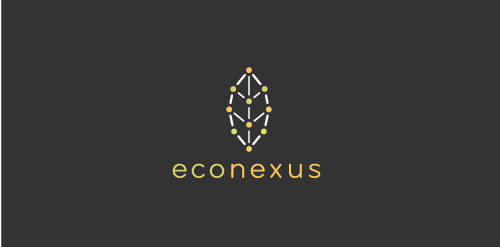
A 'nexus' of dots and lines form a leaf.
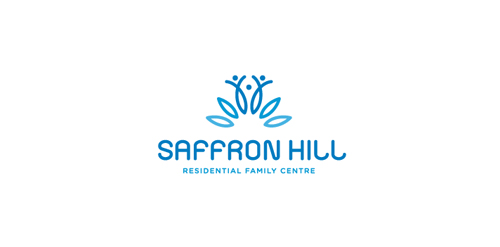
Saffron Hill - Residential Family Centre Mark Saffron Hill is a non-profit agency that provides assessment and support services to parents who have difficulty in caring for their child due to problems like violence, mental health condition, mild learning difficulty, drug problems... etc... Saffron is the most valuable spice in the world it and is worth more then gold in weight. The saffron flower has 6 blossoms and bears 3 stigmas from which the spice is produced. The family resembles the 3 valuable styles from the flower. SAFFRON HILL Typography is custom from scratch.
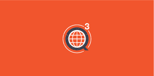
Q3 Marine Training Solutions
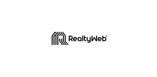
Approved logodesign for Realtyweb.com Custom made Typography. RealtyWeb.com combines 3rd party data and information on close to 30,000 state and local real estate markets to help the consumer and the real estate professional make educated decisions.
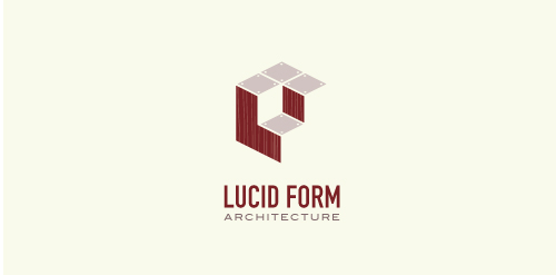
This logo is for a completely fictitious architecture studio called Lucid Form Architecture.
The icon is based on an optical illusion of a cube within a cube. Primarily, the form depicts a big cube, made of wood walls and metal-plated top surfaces, with a notch cut out of the center, resulting in a 3-D "L" shape. However, the longer one looks at this, perception begins to shift, resulting in a couple of different interpretations: 1) a small cube with a wooden wall and metal-plated bottom, in the corner of a room, hovering near the top of a tiled ceiling; 2) a room, tilted 90° clockwise, with hardwood floors, tiled walls, and a cube with a wood countertop and metal-plated side on the floor in the corner. This perception shift is important to the name, because it presents an ironic twist. To make "lucid" means to make clear, and while the icon seems to initially baffle and confuse, it ultimately encourages the viewer to challenge his or her preconceived notions of "perception." So too is the Lucid Form methodology for creating seeming impossible structures.
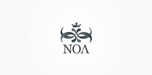
NOA – glam / electronic music club.
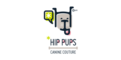
This fictitious company logo is the result of happenstance typographic exploration. I was playing around with H and I letterforms set in Platelet, and, after placing the I within the H, I noticed that it started to look like a dog face. After some modification, and with the addition of a curved P for an extended dog tongue, the resulting typographic illustration spelled "HIP." I thought it would be fun to name this fictitious company Hip Pups, which could be a shop that sells high-end dog accessories. The Registered symbol is integrated creatively into the mark by spelling "RUFF!"
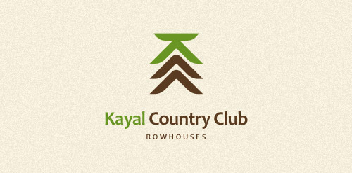
Row Houses
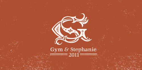
Logo for wedding - Gym and Stephanie
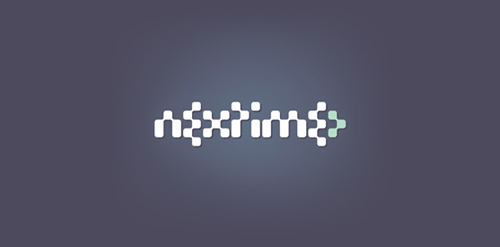
Nextime is a clubbing / electronic music portal.
Our logo inspiration gallery will give you the creative boost you're looking for. Get your daily dose of logo design inspiration to work on your own logo design projects and get your business going. Be amazed by our logo designers and their brand guidelines. We are here to help you impress your clients and our fellow designers. Professionalize your logo design skills and get yourself to a new level. Browse our logo design gallery and discover all the new logo design trends and much more. We know you love logos!