
Highest rated logos
Most rated logos – Page 352
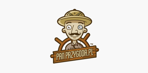
Logo design for company which organizing intergration trips. "Pan Przygoda" in english means "Mr. Adventure". - - - Made for Motyf.pl


Logotype made for little printhouse from UK. The heart refers to the passion with which they indulge in their work; folded element ambiguosly refers to paper.

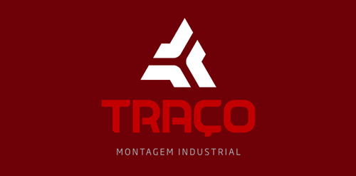
"Our goal for a study of implementation of the new brand was to be based on the ideas and key objectives of the company are: Provide industrial assembly and maintenance services with quality and efficiency, which results in a competitive price and profitability. For the development of typography, seek work in the union of metal objects of everyday business, such as pipes, metal profiles and iron sheets, thus creating a unique and solid typography.”
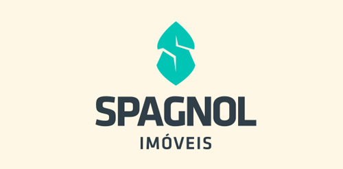
"We seek to refer the "S" in a caravel, indicating demand for the ideal property for each client.”
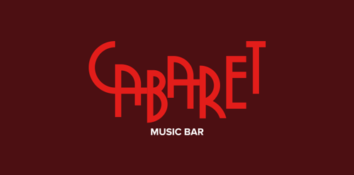
"The typography was based on Art Deco of the 40s and 50’s themed cabaret was applied in all material of the bar, since the internal communication such as clothing and outdoor applications.”
Logo for a local blogshop.
Logo of thai Restaurant
Music Bird Logo
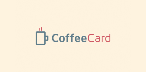
CoffeeCard is an app which allows you to keep all of your coffee loyalty cards in one convenient location on any supported platform (iPhone, Android).
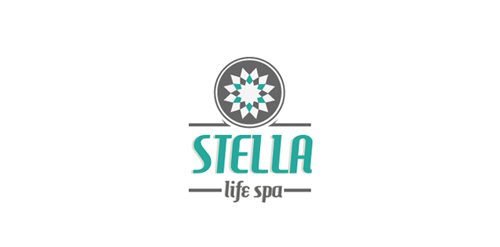
Stella Life Spa is a modern luxury day spa specialising in healthy skin treatments and makeup artistry.
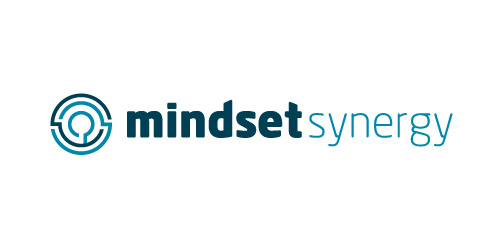
The main iconic feature of the logo mark is the abstracted version of the historic Labyrinth which is a structure deriving from Greek Mythology. It is said that the Labyrinth was originally built by Artificer Daedalus for King Minos of Crete and It’s sole purpose was to hold the mythical creature that was half man and half bull (a minotaur). The Labyrinth was built so that the minotaur was held right in the centre of the labyrinth and was designed so that it was near impossible for the minotaur to escape the labyrinth. Ariadne who was the daughter of King Minos was put in charge of the Labyrinth which held the minotaur and she later helped Theasus (mythical founder of Athens, Greece) in killing the minotaur by providing him with a sword and a ball of thread so he could find his way back out of the Labyrinth. Traditionally a labyrinth has only 1 entrance and exit - however this abstracted version of the labyrinth has two - this is because in both life and business there is always more than one way to succeed and move forward and the limits are endless. ----- Metaphorically speaking in regards to Psychology. The centre of the labyrinth is where someone in need of therapy may feel they are at, unable to find their way out of the dark hole in their mind, stuck in a maze. The minator is the psychological block that is holding them down. The idea is that Mindset will go into the subjects mind (theoretically of course), into the maze and remove the minator (the block) on their mind and help the subject find their way out of the maze with the help of therapy. --- Metaphorically speaking in regards to Business Coaching. It’s very easy for a business owner to feel as though they are not in control of the direction of their business. It’s also very easy for them to get lost on the wrong path making it sometimes very hard to get back onto the right path for them. Causing the same mental affects as getting lost in a maze (or labyrinth). ---- The overall concept of this mark is to portray mindset synergy as a company who can and will strive to find the best path to the same goal - success and/or the ability to cope.
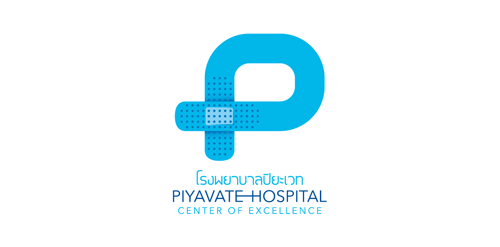
A Thailand's leading hospital based in Bangkok city. The 1st prize award-winning logo contest.
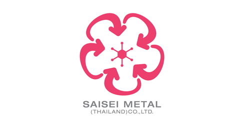
A Thai-Japanese joint venture business, metal-recycling.
Lettering for store.
Acipencer is a restaurant specializing in processing specialty dishes using ingredients sturgeon, the fish are highly valued fishery, their flesh are more firmer than other fish common, aromatic flavor. Concept: In England and Wales, the sturgeon, along with whales and porpoises, is a royal fish. logo based on this idea to show pictures sturgeon, stately, noble
Logo redesign for natural sun and skin care line.
A concept. A visual play on words.
Logo for a Ecommerce website
May Flora
logo for ebook fitness
Training - Consulting and promoting Co.
DM
Amzuri is a business consultancy that aims to help individuals and teams get clarity about what they want, and make connections between people, systems, teams and the environment that they operate in. Inkbot Design was hired to create a brand for the business consultant in 2013.
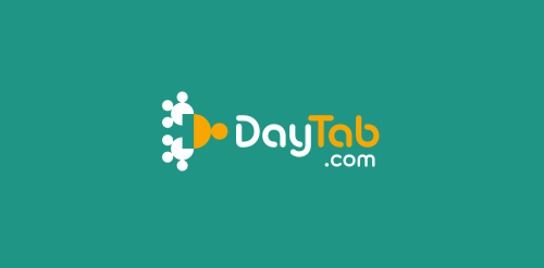
Web application that helps to effectively manage time, employees/co-workers, customers, and sales. DayTab supports the process of customer communication, collaboration and information sharing within the company. Its functionality centers around the concept of structure, hence the simple "tree" metaphor in the logo. The symbol is built only with circle segments and - with a bit of imagination - you could even see human silhouettes there. It shouldn`t require much effort to notice the "D" initial.
Our logo inspiration gallery will give you the creative boost you're looking for. Get your daily dose of logo design inspiration to work on your own logo design projects and get your business going. Be amazed by our logo designers and their brand guidelines. We are here to help you impress your clients and our fellow designers. Professionalize your logo design skills and get yourself to a new level. Browse our logo design gallery and discover all the new logo design trends and much more. We know you love logos!