Most viewed logos – Page 323

Logo Design for Xunion.


This logo successfully represents this land developing and civil engineering firm as a contemporary business with their eye on the future. The mark is inspired by a standard target tool used in their industries. Because the majority of W+A’s clients are from within these industries, this provides an excellent communication. The negative space from within the typography creates the “+” in the name, but also serves as a crosshair, as seen in the tools of their trade.
A Four Wheeler Showroom

Stella Life Spa is a modern luxury day spa specialising in healthy skin treatments and makeup artistry.


For ice tea shop

Handmade soap.

Client wanted a modern, minimalistic and abstract depiction of a lion`s head. Other keywords included: smart, honest, secure, strong, reliable, easy to work with and friendly.

u-milk

Just for fun

Concept logo design for a client in the construction and building industry here in St. Louis.

Logo and label design for a Texas based ranch that grows and sells their own olive oil.
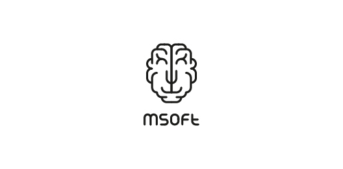
MSoft - this is a young team it-specialists. The name stands for MindSoft. Based on this, we have created a logo transformer schematic showing the brain. Sign acquires different characters thanks to those who entered into it. A myriad of options that allows you to personalize each carrier branding, while fully preserving the recognizability.

Logo for a speciality food store

"Casa do Salame is a family company that has worked for over 15 years with handmade production of sausages and several other farm products. For the development of this brand, we added a more traditional/manufactured feel to it so that the public can feel that the products are unique and handmade. We used color tones that remind of Italy (the origin of the products and the family), and to make the handmade aspect clear, we used golden hotstamping on the materials.”


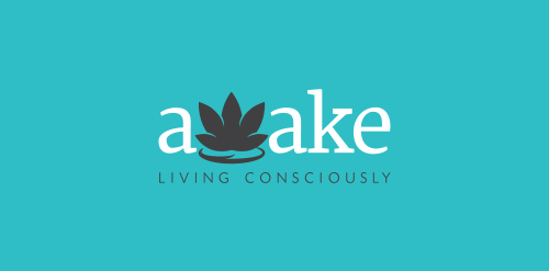
Awake: Living Consciously is a lifestyle blog focusing on enlightening yourself to live a more conscious life.

Logo idea for a coffee shop. Custom font