Most viewed logos – Page 346

all id: http://www.behance.net/gallery/RoaP/1773510


Just for fun
Logo proposal for an Arts, Music, Literature, Film and Dance festival held annually in Colombo, Sri Lanka.
View the complete project on Behance:
http://www.behance.net/gallery/Logo-proposal-for-a-festival/12319151

An unused proposal.

Snor Club
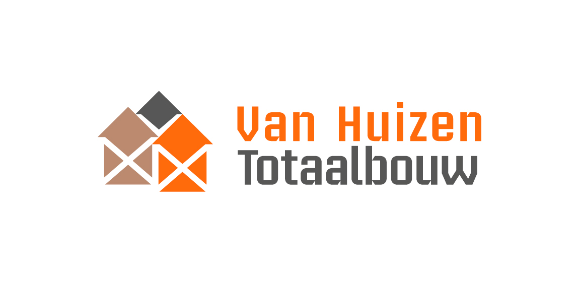
Building company. Their 3 pillars of work segment are 'Rebuild, renovate, installation'. Rebuild with concrete, grey color. Renovate with timber, brown color. Installation with copper, orange color. Scaffolding stands for building work in negative white. Houses stands for the name 'Huizen' Dutch for houses.
Logo is made of Pantone colors 1585C and CMYK 80K with an overlay of both for the brown color.
Logo in use at http://www.huizentotaalbouw.nl/.
The logo is depicted in red and black colors. The hand prints and the sign of 'Om' give a religious and spiritual touch to the logo.

Mark for beekeeper

Modus Vivendi are distributors of wellness products. Modus Vivendi means 'a way of life'

El concepto se trabajó en base al ‘’Pin’’ de ubicación, esto refiere a la búsqueda de un lugar. El triángulo inconcluso representa el techo de una casa, que también connota una flecha. Al juntar estos elementos se genera la idea que el hogar es donde todos llegamos.


Logo for IT company

A logo for Cadbury Bournville to support their campaign of Not So Sweet Nights of introducing comedians and music artists together on one stage.

A Doctor-bird which is moving rapidly upwards in an angle. The Doctor Bird (Trochilus polytmus) is the common name for the Swallow-Tail Hummingbird, the national bird of Jamaica. Unused concept. For sale.

electrical company
IT Industry

Logo for the social network.

Empiria security --- www.nlogo.pl

Tortilla Chicks

Blogging about photography and stuff!

AllOut Challenge is Tennis academy

A new brand for handmade bags.

A logo that i designed for Vegetarian food company
Logo para loja de comércio de pneus automotivos. to shop for automotive tire trade.