Most viewed logos – Page 346

Snor Club


Logo based on basic navigation symbol made for Outdoor equipment producer. the main idea is the logo is based on the known symbol, which show the right way in the outdoor nature.

shoe store

Logo for company which sells board games. "6 oczek" - means 6 pips on a dice (in Polish). Also word "pip" means "eye" in Polish so it's a little wordplay :)

Logo for company that makes bespoke herbal remedies for a range of ailments, skin complaints and general well-being.
Ioannis Panagopoulos is a Software Engineeer.
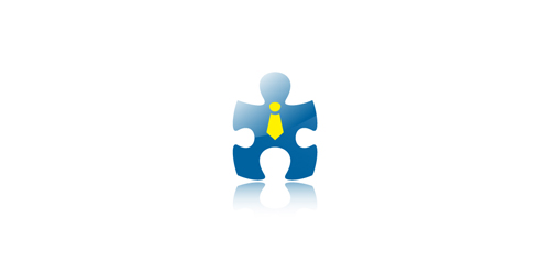
“The missing piece” of a puzzle was the concept for the symbol of this identity. As a result, a “human-lookalike” symbol was created based on a piece of puzzle, to show that without it, a project cannot be completed.

Monte is on-line travel service
This is the official logo for 1AM Management. http://1ammanagement.com

Character logo created for Johnny Rotten's Aqua Adventures. A depot specializing in water sports and activities.
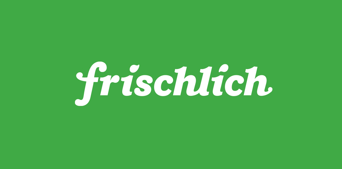
"Frischlich" is a German brand, with the word "Frisch" meaning "fresh" and "lich" in German is an ending for adjectives, "glücklich" = happy or "herrlich" = great. The company delivers fresh produce, meats and cheeses and more to your doorstep, tailored to your family size.
Classic with a modern feel. Black and Yellow

An upcoming website for floral agreements & such.

A Judo Sports Club in Austria/ Vienna For Basic Judo Trainers. "Awiar" is the name of a mountain

Disposable clothes and accessories

Unused proposal for an aromatherapist

Mark for beekeeper

Nomawear is a formal fashionwear startup. The mark based on the top-left portion of the Union Jack, Nomawear are based in Northern English province of Carlisle. The mark forms a abstracted N shape & an arrow leading the eye towards the name.

Reinaphics was conceptualized with a passion for creating & innovating detailed and modern websites, graphics, prints, icons & brand identity using emerging technologies for transforming the client’s vision into digital works of art by delivering differentiating solutions from concept to execution.

logo for cafe in Toronto
Paint Additives & Building Material Exporting Company
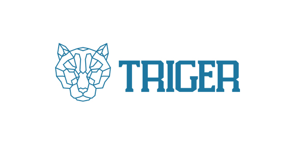
Triger - A simple yet creative design. At first look it is just a simple head of a tiger but if you look thoroughly, you will see another 2 tiger heads in a side view. A letter 'T' in the forehead of the tiger can also be visualize.
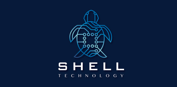
Innovative and unique technology turtle logo design. The entire turtle is designed with circuitboard lines that interconnect and seamlessly flow together to create the formation of this distinctive tortoise logo. The lines and circles that make up the design represent circuit computing connections and high-technology devices. https://www.logomood.com/downloads/turtle-shell-technology/
Logo for production company located in Cairo, Egypt.