
Logo inspiration
Inspirational logos
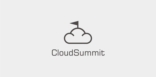
Logo for cloud computing company. For sale.


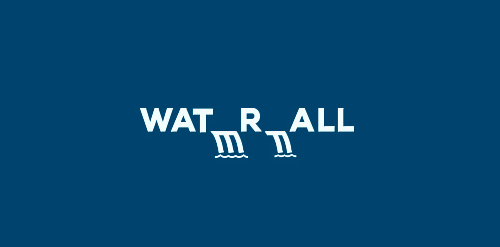
Waterfall concept typo
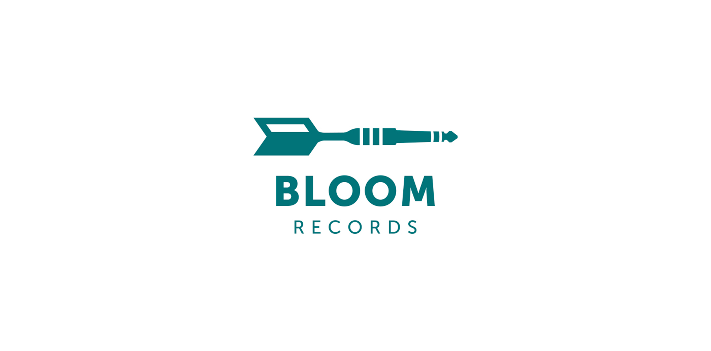
Brand Identity designed for a new emergent rock record label.
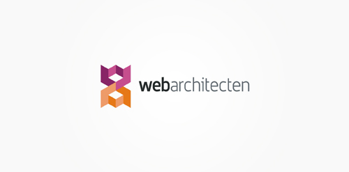
webarchitecten is a web design studio based in Netherlands.
Logo design for Cobra Global Consulting. Cobra Global Consulting provides database consultancy around all aspect of Microsoft SQL Server stack of technologies from infrastructure architecture to database development. Company slogan: Consulting for the future.
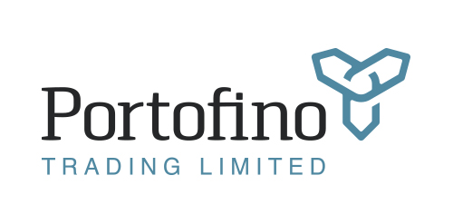
Portofinio Trading Limited is a company who sell promotional materials, and also provide technology equipment to businesses.
After careful thought, in its most basic form the Portofino Trading Ltd product offering (be it promotional items or technology) helps business build connections to grow and succeed. The icon here has been designed to represent the idea of being ‘continuously connected’, growing, adapting and developing. Follow the line in either direction, and at its core you are taken back out towards a different location. Interlocking like a chain that never ends. Also looking like a propeller to represent the clients success with the support and guidance from Portofino Trading Ltd.
This icon also represents the companies ability to build relationships, and quickly adapt and see trends.
Overall the design is confident, timeless, and gives the impression of an established and trustworthy business.
View more information here: http://logogeek.co.uk/?portfolio=portofino-trading-limited
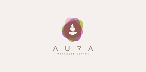
The logo is made from six stone shapes. Three make an abstract meditating figure and three create an aura surrounding the figure.
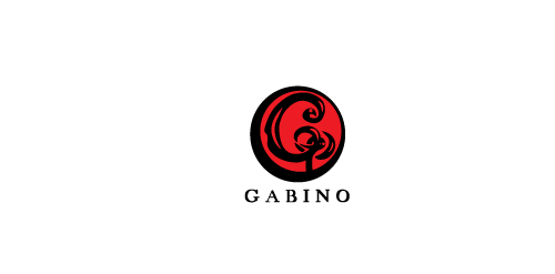
GABINO is fresh modern dynamic brand with short easy memorable name. It will suite well to any business or industry.
www.lukaszjackiewicz.pl
Logo for wine producer.
Just colorful logo idea.
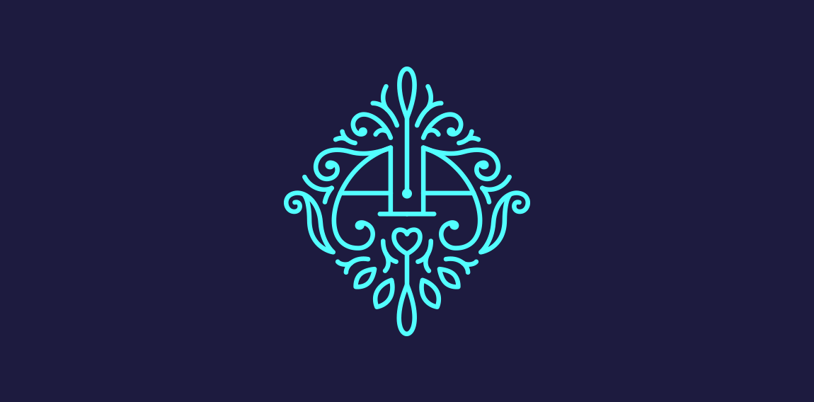
Monogram for my friends Artur & Alina The same first letter of their names gave me the idea to create a symmetrical sign.
taurus logo
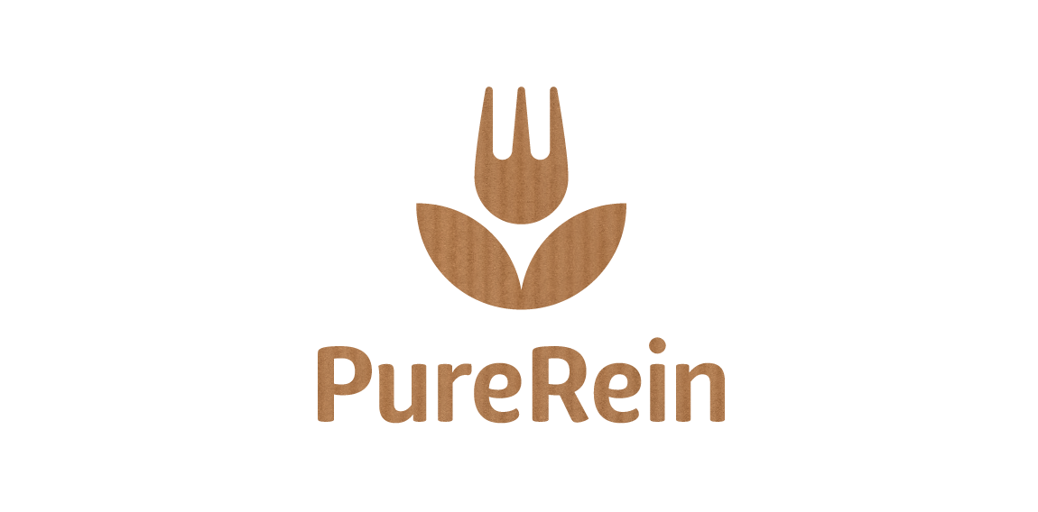
PureRein is a producer and distributor of healthy food Its founder, valuing the work of designers, like Polish logo design legend – Karol Śliwka – wished for a classically simple logomark. The created graphic combines symbols of a fork and a flower, representing food, nature and happiness. The fitting font is rounded, organic-like. Working with the Purerein brand consisted also of designing an extensive series of packaging with hand drawn illustrations of plants associated with the products.
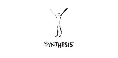
"Synthesis Centre" is a centre of physical and spritual health, in Athens. The services provided are consulting, psychotherapy, stress management, astanga yoga and more..
The concept of this corporate identity in general, is a "ball" that represents one’s soul and/or body that "unrolls" after being taken care through therapy and yoga. As a result, the symbol of this logo represents the physical & spiritual "lift-up" of a human figure, "the ending point" and the "result" of this whole experience.
In order to express its unique character, The logo was created from one single, black-inked line to show a handwritten style.
Logo for Raleigh NC softball team.
a proposed logo for Cinetele film
GoedGunstig logo
A creative depiction of a lion's head in a fish body.
Some experiment about verbicon, i hope you like :)
☆ HONORS ☆

-
shtef-sokolovich
190 logos
-
Boldflower Design Studio
189 logos
-
Ailton Marques
115 logos
-
Light Rainer
114 logos
-
Alek • Triptic.pl
107 logos
-
almosh82
96 logos
-
sadany
96 logos
-
Duminda Perera
93 logos
-
pizelato™
91 logos
-
Aleksandar
91 logos

Recent comments
حسین:
please send me...
chirag_j:
Hello is the above issue resolved?...
mrgraphics:
great logo...
Aleksandar:
Thank you Gile!...
fraGile:
Thanks a lot!...
Marko Bulatovic:
Great work!...
Popular tags
Our logo inspiration gallery will give you the creative boost you're looking for. Get your daily dose of logo design inspiration to work on your own logo design projects and get your business going. Be amazed by our logo designers and their brand guidelines. We are here to help you impress your clients and our fellow designers. Professionalize your logo design skills and get yourself to a new level. Browse our logo design gallery and discover all the new logo design trends and much more. We know you love logos!