
Logo inspiration
Inspirational logos
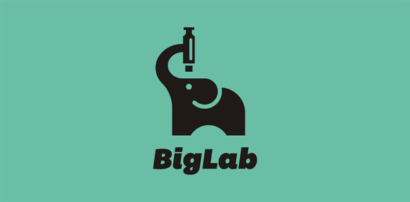
Cute little elephant. Perfect for science or labs. For sale.


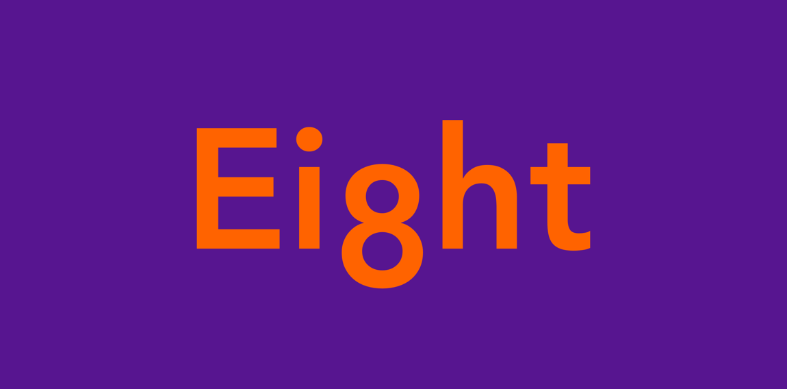
Some experiment about verbicon, i hope you like :)
My keds
Handmade shop
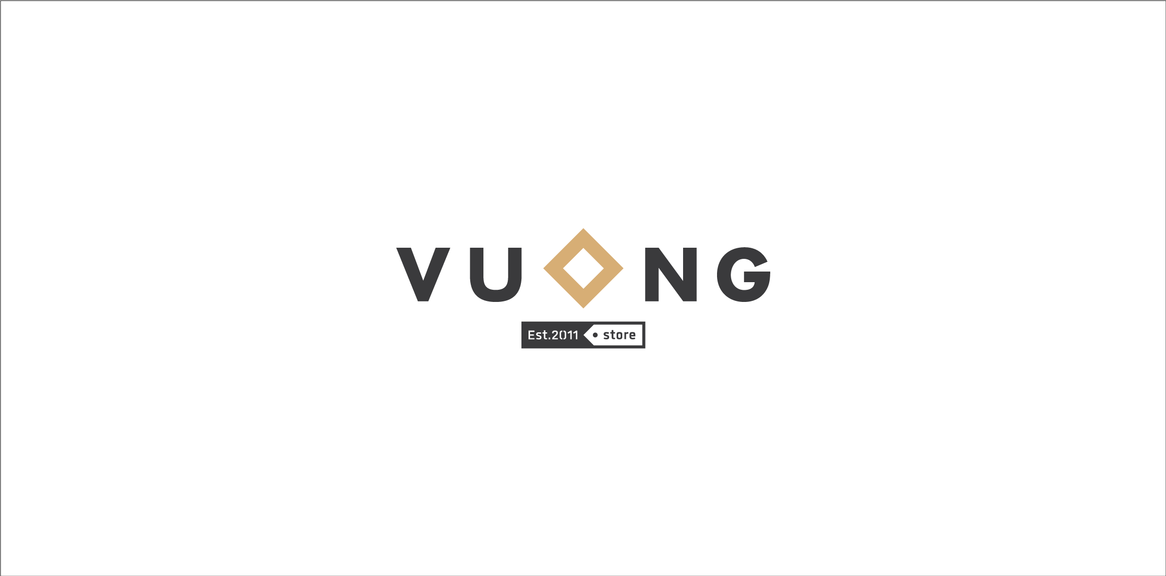
"Vuông in Vietnamese means Square" Vuong was born in 2010, it came from the passion of art and crafts produced by a passionate artist classic definition of paper, leather and fabric. Wishing to transmit classical values combined with modern designs. Vuong developed models with rich materials from papers, leather and fabrics for applications of daily handmade products. 2013, Vuong created its own Fanpage, with a desire to become a place to serve people in a friendlier and more attentive way.
Ponder logo
Conceptual logo which represents a world map,continents,speech bubble and a brain.
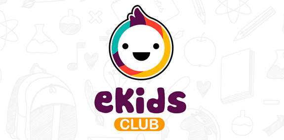
Ekids club is an English club for kids ranging from 3 to 11 based on Hai Phong city. Play to learn. Facebook: https://www.facebook.com/ekidsclub http://kanipoly.com/portfolio/ekids-club/
A new brand for women wear located in Cairo, Egypt
Logo design for boutique cake makers in Cambridge, UK. House of Cake
A rebrand of logo for a local vintage/hi-end furniture producer. The logo contains symbolic od "saw/teeth" and looks a bit luxurious also if you imagine the logo on the actual products. Which makes the brand and it´s product very special and original.
Production of natural flavors and essential oils.
.
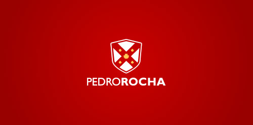
Designed for Pedro Rocha, Academic of Law in Brazil in 2012
PROJECT Panax Pharma is Czech based distributor of medicines and pharmaceuticals. I was asked to create simple and distinctive visual identity including logo manual and stationery. CONCEPT The logo contains stylized illustration of medicine mortar - traditional tool used for pharmaceuticals production and processing. The mark is reflecting susceptible and responsive approach of company through subtle rounded stylization and refined execution of it's design. Negative space used in illustration of the mortar also inspires emotions of preservation and processing content from out. Finally Optima typeface with turquoise and silver color palette completes company corporate identity design basics.
The new logo proposal for Monarch Bath Pvt. ltd. Monarch bath Pvt. Ltd. has various models active in the collections o f bathroom fittings and sanitary wares and regularly adds several new designs and brands to the product portfolio. The Company has also an exclusive range of sanitary ware to offer with a very wide choice in designer bathroom sets, wash basins, bathtubs and related items.
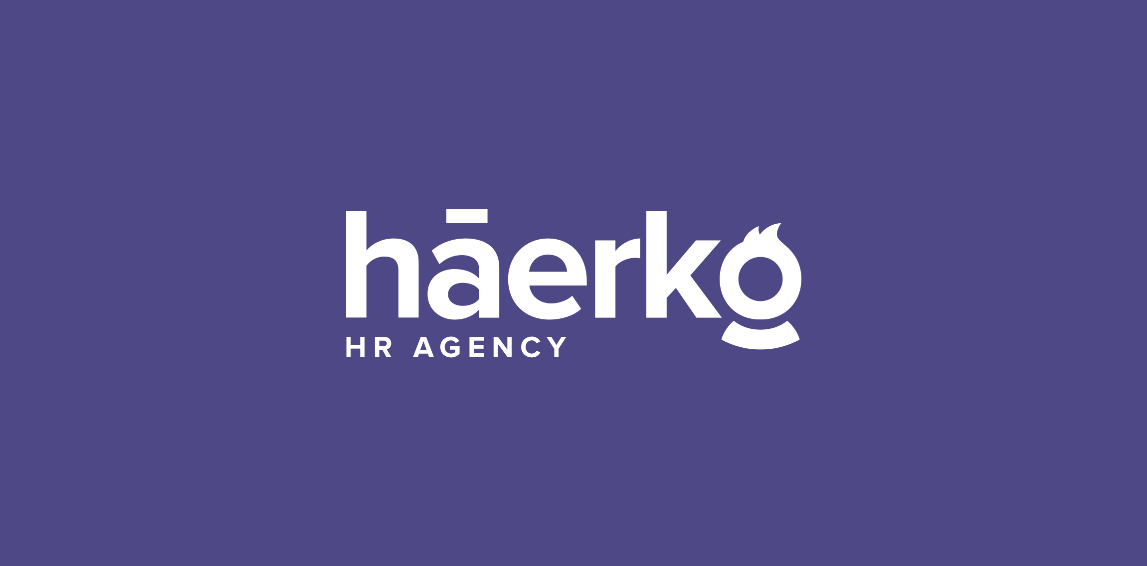
Hi everyone! My latest logo design for háerko - HR Agency. The point is the hidden men/women at the end of the logo. To be fair, I made multi-sex versions :) Check full version on my dribbble: http://bit.ly/1R8fp9v
Dumma Branding is the design house of Duminda perera. Duminda is currently involved in an ongoing logo project for 365 days, creating one Original, Clever, Wordmark/Verbicons or Negative logo for a day.
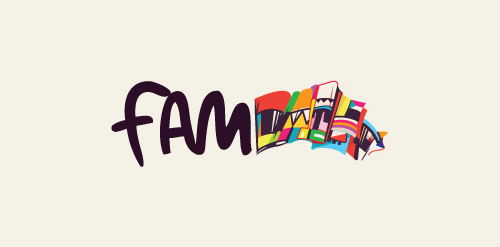
Logo for the 'Festival of Arts and Multiculturalism'.
☆ HONORS ☆

-
shtef-sokolovich
190 logos
-
Boldflower Design Studio
189 logos
-
Ailton Marques
115 logos
-
Light Rainer
114 logos
-
Alek • Triptic.pl
107 logos
-
almosh82
96 logos
-
sadany
96 logos
-
Duminda Perera
93 logos
-
pizelato™
91 logos
-
Aleksandar
91 logos

Recent comments
حسین:
please send me...
chirag_j:
Hello is the above issue resolved?...
mrgraphics:
great logo...
Aleksandar:
Thank you Gile!...
fraGile:
Thanks a lot!...
Marko Bulatovic:
Great work!...
Popular tags
Our logo inspiration gallery will give you the creative boost you're looking for. Get your daily dose of logo design inspiration to work on your own logo design projects and get your business going. Be amazed by our logo designers and their brand guidelines. We are here to help you impress your clients and our fellow designers. Professionalize your logo design skills and get yourself to a new level. Browse our logo design gallery and discover all the new logo design trends and much more. We know you love logos!