
Logo inspiration
Inspirational logos


OnGlobe Soluções Ecológicas
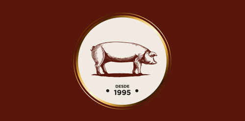
"Casa do Salame is a family company that has worked for over 15 years with handmade production of sausages and several other farm products. For the development of this brand, we added a more traditional/manufactured feel to it so that the public can feel that the products are unique and handmade. We used color tones that remind of Italy (the origin of the products and the family), and to make the handmade aspect clear, we used golden hotstamping on the materials.”
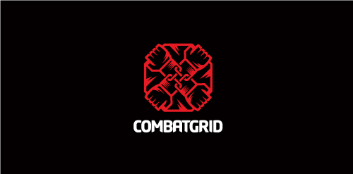
Proposal for Combatgrid an online community where aspiring MMA fighters/promoters/gym trainers/ring girls/etc can gain exposure and encourages social networking, blogging, etc, and has tools in place to make it easier for those in the MMA business to advertise themselves.
Building Engineering
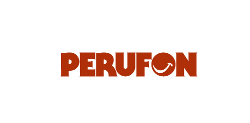
This is a logo for a Peruvian company that lets you use a land line so you can call anyone in Perú.

Logo design for inbound marketing agency. We used magnet as a symbol of attracting customers through a series of coordinated marketing actions. Additionally, curved bottom edge enhances the impression of attraction. - - - Follow us on www.fb.me/triptic.design
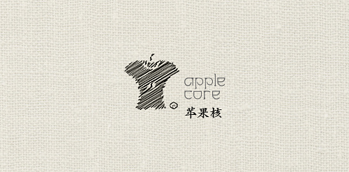
蘋果核(Apple Core) 休閒裝(Casual Wear);主營女性休閒裝的品牌。
seals and stamps
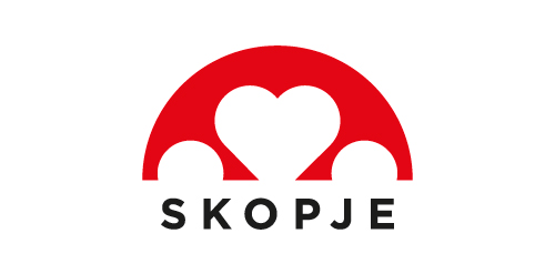
Logo design that shows the love for my hometown. The symbol represents the stone bridge that is the most viewed thing in Skopje
Some experiment about verbicon, i hope you like :)
A very simple logo design for happy co. Instead of putting a straight line below the CO part, i've made a smile, because its happy.
(Geel Al Thawra) means in Arabic (the generation of revolution ) ............The logo is for an association that had taken place after the revolution of 25 Jan in Egypt and is mainly working on spreading political awareness with also some other charity work. Concept is to make a young man releasing the dove of peace, to represent the "generation of revolution " who made the revolution and is trying hard to spread freedom,awareness and peace to everyone,
Created for my Production Design Class
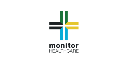
I was approached by new organisation 'Monitor Healthcare' to design their logo and brand identity.
Monitor Healthcare aim to provide people all around Africa with free medical advice via online and telephone methods. As this service is to be for the full continent I wanted to create a logo that would represent this unity.
The different colours of each section of the cross are representative of the North, East, South and West regions of Africa. The individual colours were picked based on the flags of the countries within each region.
The white cross in the middle of the logo is to symbalise the unity of the continent which Monitor Healthcare aim to provide.
Travel service logo
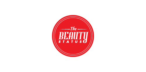
This logo was created for a hockey blog that discusses the good and bad things going on in the hockey world. The logo is meant to look like a stamp and is used to grant 'TheBeautyStatus' to certain players and teams.
☆ HONORS ☆

-
shtef-sokolovich
190 logos
-
Boldflower Design Studio
189 logos
-
Ailton Marques
115 logos
-
Light Rainer
114 logos
-
Alek • Triptic.pl
107 logos
-
almosh82
96 logos
-
sadany
96 logos
-
Duminda Perera
93 logos
-
pizelato™
91 logos
-
Aleksandar
91 logos

Recent comments
حسین:
please send me...
chirag_j:
Hello is the above issue resolved?...
mrgraphics:
great logo...
Aleksandar:
Thank you Gile!...
fraGile:
Thanks a lot!...
Marko Bulatovic:
Great work!...
Popular tags
Our logo inspiration gallery will give you the creative boost you're looking for. Get your daily dose of logo design inspiration to work on your own logo design projects and get your business going. Be amazed by our logo designers and their brand guidelines. We are here to help you impress your clients and our fellow designers. Professionalize your logo design skills and get yourself to a new level. Browse our logo design gallery and discover all the new logo design trends and much more. We know you love logos!