
Logo inspiration
Inspirational logos


A logo created for an innovations company that deals with Asia frequently, the idea was based around The Hindu God Ganesh, lord of success.
Some experiment about verbicon, i hope you like :)
Concept for a a female hospital with focus on cancer treatment.The client wanted to convey an image of a wellness hotel instead of a hospital through the logo. The mark has a lotus flower with a female silhouette in the middle.The patients coming to the hospital get a second chance at life and what better to communicate this journey than the lotus which has always been traditionally used as a symbol of regeneration and rebirth .The varied layers signify this very process
Bridges Community Church Logo represents three bridges that church has on their property.
Stefani (hair studio)- logo.
Logo forSaaya an online based in in Brisbane. The store is all about unique handcrafted and hand woven soft furnishings and home wares.
Mark concept proposal for small family business Perga+. A company engaged in the bee bread "Perga" production and trade.
Dumma Branding is the design house of Duminda Perera. Duminda is currently involved in an ongoing logo project for design every day one Original, Clever, Wordmark/Verbicons or Negative logo.
Want Ads website
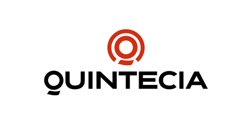
Human resources consulting organization based in Paris, Quintecia trusted Brand Brothers to redesign its corporate identity and its global branding. Professionalism, credibility, transparency and proximity are the values passed through this new identity, wich includes an original typography.
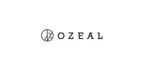
Ozeal is a group of ambitious adventurers, a large family, based in London, leading different ways of life but sharing the same mission: providing all our customers with high quality, richly designed yet low-priced glasses. The idea to set up a website and sell high quality glasses at a low price to anyone in need was brought up about 3 years ago and then we started to embark on this journey. The truth is: we do enjoy it. We name our website as OZEAL. Because we are enthusiasts, we are passionate and we are carrying on our mission through this website with great zeal. Most importantly, we want to pass this zeal on to any of you.
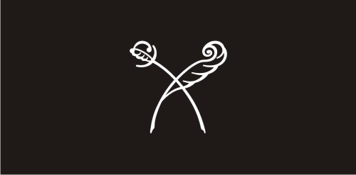
This is sign for woman-copywriter, who write texts at aristokratic style
Logo for a contest for Polish Space Agency. Logo shows a planet and arrows as a 'reaching for the stars' symbol. It's dynamic but stable as well. I'd like to show that logo as a tribute to momdernism polish logos from '60, '70 which was very expresive in its form but simple and clean as well.
Logotype designed for a gaming company.
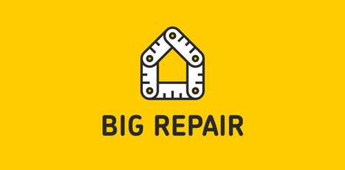
Logo for a project about repair. See more: http://logomachine.net/

Power tools
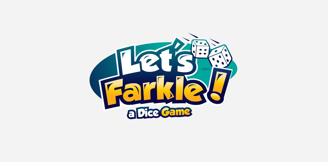
playful logo for a dice game with bold font and colors with dice cubes to represent what they do !
☆ HONORS ☆

-
shtef-sokolovich
190 logos
-
Boldflower Design Studio
189 logos
-
Ailton Marques
115 logos
-
Light Rainer
114 logos
-
Alek • Triptic.pl
107 logos
-
almosh82
96 logos
-
sadany
96 logos
-
Duminda Perera
93 logos
-
pizelato™
91 logos
-
Aleksandar
91 logos

Recent comments
حسین:
please send me...
chirag_j:
Hello is the above issue resolved?...
mrgraphics:
great logo...
Aleksandar:
Thank you Gile!...
fraGile:
Thanks a lot!...
Marko Bulatovic:
Great work!...
Popular tags
Our logo inspiration gallery will give you the creative boost you're looking for. Get your daily dose of logo design inspiration to work on your own logo design projects and get your business going. Be amazed by our logo designers and their brand guidelines. We are here to help you impress your clients and our fellow designers. Professionalize your logo design skills and get yourself to a new level. Browse our logo design gallery and discover all the new logo design trends and much more. We know you love logos!